(Archive) Advertising District / Dump-Place
-
 19-April 07
-

 Xtreme97
Offline
It's pretty nice, as far as aesthetics go. I'm liking that little park in the middle but it could do with some more foliage. The entrance building is pretty nice, and I kind of like that backstage area.
 -

 leonidas
Offline
NGT, great to see you trying out RCT2, I'm concerned about that high hill/curve on the
very left, it makes thing unbalanced. I'd make that into a lower curve. -

 Nitrous Oxide
Offline
ScOtLaNdS_FiNeSt, not much to comment on. It looks like you spent 10 minutes on that. Your improving, but your buildings look like something Chris Sawyer would put in one of the scenarios. Very basic and boring.. try adding some more detail into them and making them more diverse then just a square.
 -

 Turtle
Offline
^No, it's not even that. It's the fact that he posts a layout for a wooden coaster, and we get "layout's fine, zoom in on that tiny spot of architecture."
 -

 ScOtLaNdS_FiNeSt
Offline
Thanks for the comments and criticism you 2
 I will add more foliage to the park in the entrance area and every time i think about building a completely square structure i will hear you shouting in my ear nitrous
-

 CoasterCreator9
Offline
Hello all, this is my first major project in.. Awhile. I want to make a terrain woodie, and I have a rough design set up on a very basic landscape (obviously unfinished). I could use some criticism on the layout, I want it to be just right.
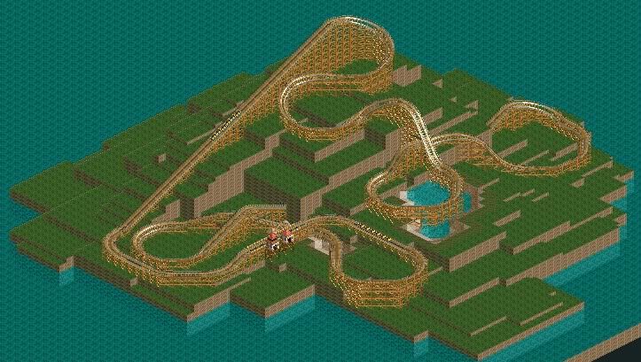
Cheers, CC9 -

 Comet
Offline
Pretty cool, I love the whole section leading up to the drop around the lake. That drop looks like it would be a major highlight. Maybe try to avoid having that long of an underground portion tho
 -

 CoasterCreator9
Offline
Pretty cool, I love the whole section leading up to the drop around the lake. That drop looks like it would be a major highlight. Maybe try to avoid having that long of an underground portion tho
Yeah, I agree about the underground bit.. Trying to figure a way around that. Any ideas? -

 GigaG
Offline


B&M Support is So Difficult to Construct..
This should be a dive machine, not a sit-down. But this is pretty good - I know that the "Korean" building style is usually a bit off-realistic. By the way ,is that a bumper cars in the corner? Or is it the bumper cars being used to make a building. -

 Dadit
Offline
Hello guys,
first time i show you some pictures of my big non-cso project. I´m building 4 Themparks on one map. "The Kingdoms" the frist park is nearly finished "Adventure Kingdom".


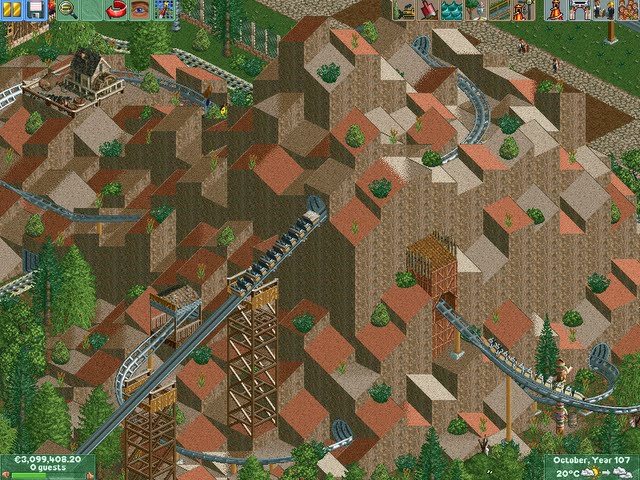


-

 Xtreme97
Offline
I'm loving alot of the screens, but try not to post so many. Lovely work though. The western buildings are excellent. But in the thrid/fourth screens, I'm not liking the doors on buildings in the top-left.
 -

 Fizzix
Offline
You've got very nice buildings, but your foliage desperately needs work. Try changing the ground type under your big trees to dirt, and the surrounding shrubs/flowers to dirt/grass. Aslo, using the Hedge fences can fill up the look of foliage, so definitely give that a try!
 Tags
Tags
- No Tags


