(Archive) Advertising District / Dump-Place
-
 19-April 07
-

 posix
Offline
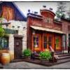
Very very well done. The building is communicating and people immediately understood it was meant to be a cage for something.
 -

 Roomie
Offline
haha instantly knew what it was from. the lookout tower looks a little oversized though. Like a babies head.
 -
 gijssie1234
Offline
sorry i don´t like the colours , and it looks so fat ! i would make it some smaller, Sorry i´m not like it .
 -
 Loopy
Offline
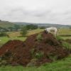
Thanks for all the comments on the previous screen. I will look into what I can do to try and add a bit more atmosphere to that area.
For now, here's a small unfinished teaser of Manta:
-

 Nitrous Oxide
Offline
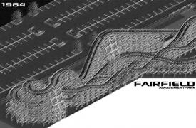
Here is a design I started today in my current park Fairfield. The park is still in early developement and will be a timeline park and updated yearly*. I'm attempting alot of coasters that I've never built in the past, including this wooden. I've normally stuck to 'out and back' and 'modern' wooden coasters. Anyways, I just started this park and plan on releasing the first download based in the 80s. Don't expect a download till sometime in Spring 12'. But once I get things rolling a bit more I will start a thread with frequent updates.
*Yearly updates will probably be monthly or every 2 months once I release the first download.
-

 nin
Offline
Loopy. I didn't think I had much of a favorite LL builder, but I can firmly say that you must be that guy. That screen is awesome. It rather simple on a technical level, and lacks the detail most everyone throws into their parks today, but it still remains better than all of those.
NO, that's pretty cool too. Not too much to comment on, other than the lovely look of that coaster. Not sure how accurate that large of a parking lot may be for an amusement park in the '60's, but I'm sure I could be corrected. All I know of large parking lots at that time is the one outside Disneyland. Excited to see the rest. -

 Nitrous Oxide
Offline
^ Yea, I was just looking for some feedback on the layout. Like I said, these types have never been my strong point. As for the parking lot, I'm not too worried about it as I won't be releasing the park till I get in the 1980s. Thanks for the feedback though man.
 -
 rct2isboss
Offline
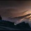
The random snow needs to be changed into a peak. I dont like the stacked rounded trees on the bottom. Lastly, are there going to be peeps?
 -

Wicksteed Offline
I like the round trees at the bottom (they are not stacked btw...). But I do think that the Mountain looks a bit random. The rest looks rather nice though. -

 chorkiel
Offline
I don't like those rounded trees on the bottom and that mountain peek.
and I can't actually find anything that I do like.
It feels so lifeless, I guess. -

 Xtreme97
Offline
I actually like those rounded trees. But they would be better suited to Alice in Wonderland.
I'm kind of liking that top right corner of the screen and perhaps the station. And like the others said, make the ice at the top of the mountain a peak.
But keep working at it!
-

 Turtle
Offline
Pretty amazing ride in RCT3...
http://www.youtube.c...h?v=C_tD9e7m-oY
Well worth watching until the end.
 Tags
Tags
- No Tags


