(Archive) Advertising District / Dump-Place
-
 19-April 07
-

 robbie92
Offline
Tim, that's a fantastic billboard there. I love the use of cacti. For the rocks underneath, I'd recommend changing the directions or orientations of some of theme so it looks more random and natural.
 -
 Timothy Cross
Offline
Tim, that's a fantastic billboard there. I love the use of cacti. For the rocks underneath, I'd recommend changing the directions or orientations of some of theme so it looks more random and natural.
Great suggestion. Will do. Also, see any SFSF inspiration in there?
If only you would finish something...
Planning and research for Spaceship Earth has been on-going for the better part of six months, and I'm still far from bored with this. I have the patience to finish this as it should be evident considering it took these six months of planning and research simply to perfect the park concept. Like I said, still not bored. So this has a better chance of seeing completion than any park I've worked on in the past two years, including Spaceport Omega. But I'm done making promises. We'll just have to wait and see.. -

 JDP
Offline
yeah and he's one of the very few people that annoys everyone (at times) but still produces very promising workIf only you would finish something...
-JDP -

 nin
Offline
Well I'm hoping you still would hold interest after only building a fraction of a road.
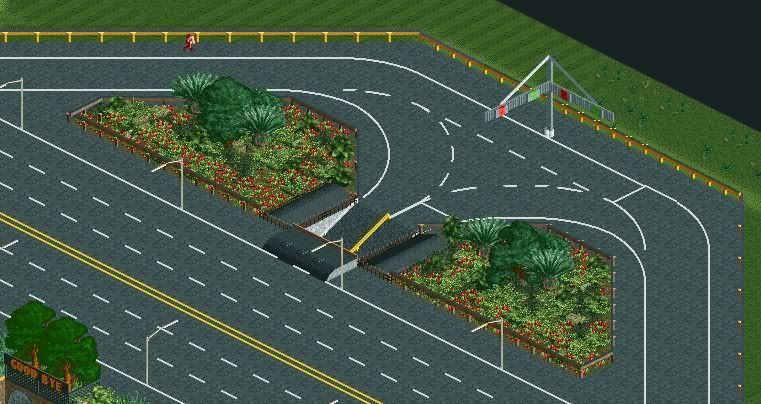
That being said, it is a nice road. I suggest placing a more legit median between the two sides, as something of this caliber screams for that rather than an empty asphalt-filled space. I also don't like the palm tree colors; I hate it when people color them that way. -

 Timothy Cross
Offline
Thanks, bud.
The road has turn lanes to come, that's where the median comes in to play. The colors are still to be determined.
This is actually a screen purposely fitted for the dump-place. The ad and then finished product will explain more. -

 Nitrous Oxide
Offline
Love it FantastiCo. I hope the park and coasters are just as appealing. Other than Canyoneer*, I really have not seen many desert themed parks done. *Which was only a design and not a full park obviously. As with every project I comment on, can't wait to see the coasters.
 -

 Xophe
Offline
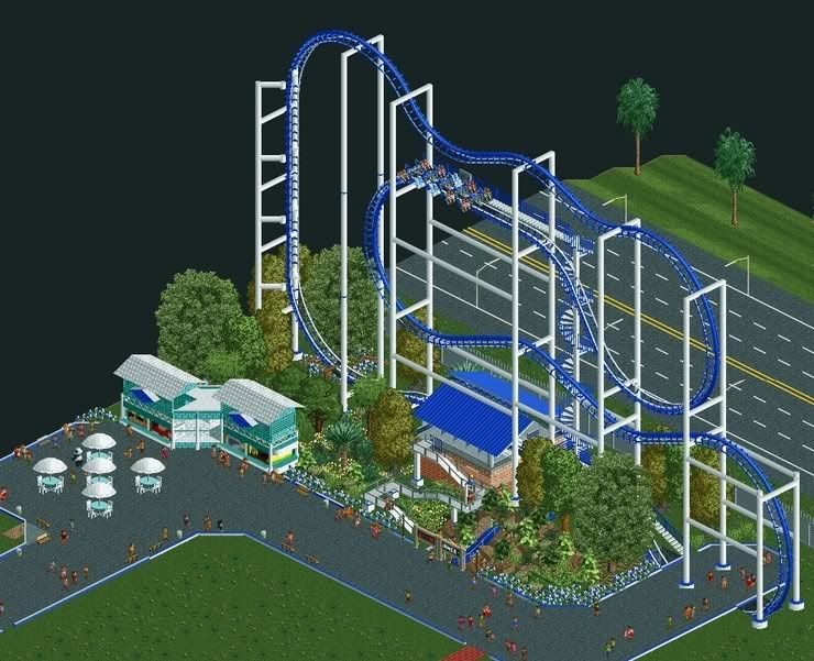
Looks good, but since there's no paths on the right side of the screen there's a lot of stuff that peeps wouldn't be able to see, and because it's an inverted coaster the riders wouldn't see it either. Maybe you could build a monorail or something through those trees so people could get a nice view of all those details like the waterfall.
 -
 coasterfreak101
Offline
I really don't think it's worth it to try for a ZacSpin in RCT2. It's honestly ugly and the scale is really off.
Also, in terms of traffic flow, you don't want a light at an interchange of two highways. Ramps are designed to ease traffic flow, not to stop it. -

 Timothy Cross
Offline
^ Congats,you'rnoperfiGeit???HahahwatcmgebanneI'vbeesicfosolonwhewilthien?
Xtreme97 was the only one to see the unedited post.
Yes, I've been sicfosolon -

 CoolCody
Offline
Also, in terms of traffic flow, you don't want a light at an interchange of two highways. Ramps are designed to ease traffic flow, not to stop it.
Works fine in Alabama & many other southern/ north eastern States. -

 Insanity
Offline
Shambhala??
Looks professional, Love the use of the lamps along with the use of netting.
the glitchy vertical support does throw me off a little, though I see what you're trying to do.
Also, that tree on the bottom-left looks extremely 'real'... new scenery??
 Tags
Tags
- No Tags

