(Archive) Advertising District / Dump-Place
-
 19-April 07
-

 Xtreme97
Offline
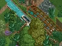
Nice screen, but try to use a wider variety of textures. Things like wooden walls and fences really break up the mono-tone station. Also, try to diversify your foliage. That one shrub and the reeds are kind of boring. But I like the rowing boats.
 -

 ivo
Offline
Your technnical level is amazing. You truely know how this game works and know how to built. But for me when there aren't any ideas it ain't intresting. same for this design. It is ok. But it would never be one of those maps where I come back for another cup of inspiration. I prefer creativity above technical a lot. But hey, there are a lot of people on this site who do like this.
And I think all this work is word a own topic.
---
Something old. I made a few of those mini maps. None finished and now lost.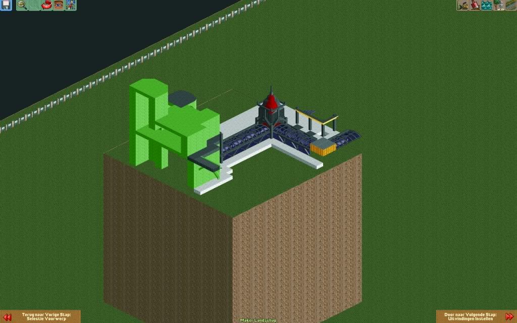
And something for a Road Rally (or was it avenged?) a long time ago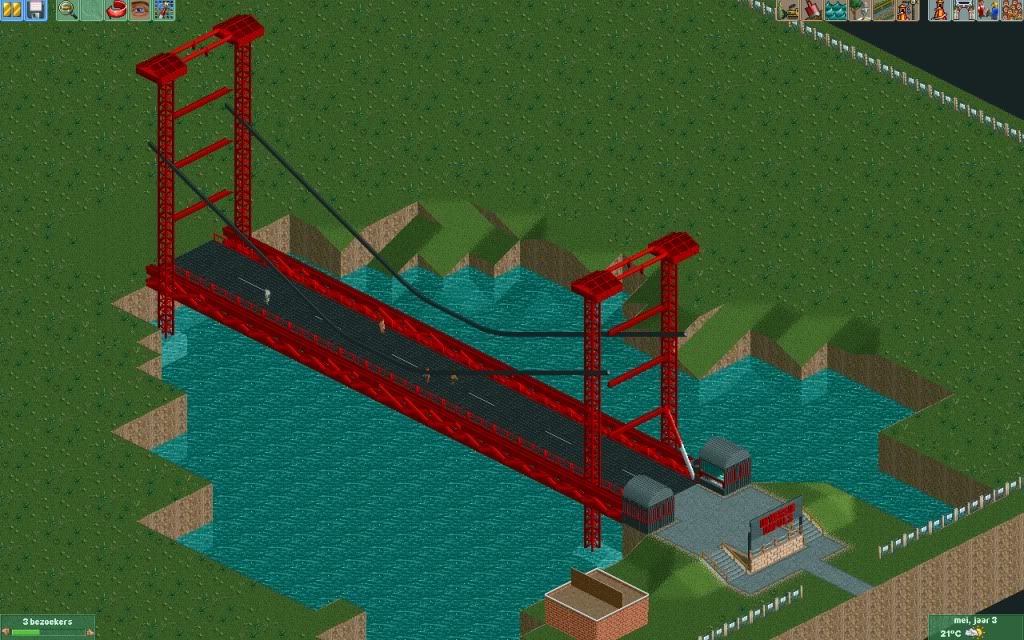
-

 SSSammy
Offline
i really want to like it because it is technically good, but it is completely soulless. maybe add a more defined treeline/facade to the back to make it seem less "things in a place" - ey.
 -

 Comet
Offline
That thematic element with the waterfall seems way too vital to be so hidden from peeps view
 -

 Super G
Offline
Colorado Fan: I love it!
Ivo: Looks fun!
Funkymon: That's not the right spirit, you have to practice bo turn better with CSO... -

 robbie92
Offline
Now THAT is how you do NCSO. Classy and atmospheric without being a mess. Wonderful!
 -
 F0ndue
Offline
Very nice, CF, but the building with the waterfall doesn't seem to fit in the african theme(I guess you're aiming for a Black Mamba style ride).
 -

 nin
Offline
It is my SFMM, but I'm allowing enigma to complete it to his liking. Looking good so far!
 -

 nin
Offline
This is the only screen I have from the original park without opening said original park:
 Tags
Tags
- No Tags
