(Archive) Advertising District / Dump-Place
-
 19-April 07
-

 JDP
Offline
^yeah i know dude. im just sayin the color choice is too bland to be surrounded by "general" theming. an eye opening coaster color is key and this really looks like a cf park... look at that carousel, resembles cedar points and dorney's
-JDP -

 Top Gun
Offline
Did someone mention something about Top Gun? Cause that's not my favorite roller coaster or anything...
 -

 funkeymon
Offline
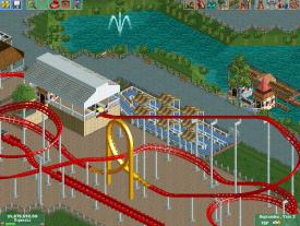
That looks pretty awesome! The only problem is that the drop tower sticks out way too much.
 -
 chorkiel
Offline
what funkeymon said.
Change the colors of the drop tower, if you do that; it'll be an amazing screen. -

 nin
Offline
I really, really like that. Maybe throw in an accenting color, like fuchsia or light blue. Nothing too strong though, just to break up the sand color a bit.
 -

inVersed Offline
'Tis serene. Perhaps considering adding a water feature like a fountain to the middle of the pond to break it up a bit. Also the paths look a bit lifeless, perhaps you were going for the natural feel here but I think it would look better with more color and more features (like perhaps a food vender or something) -

 In:Cities
Offline
Very beautiful. I love it.
However, Inversed makes some strong points.
And I would suggest adding some flowers to provide just a hint of color. Keep it minimal though:] Keep going! -

 JDP
Offline
the fountain and flowers are great ideas. but seriously that screen is really nice and the supports on the coaster look well thought out, keep it up
-JDP -

 Liampie
Offline
I think the fences look horrible... It's this particular fence that doesn't look good in large quantities. Besides adding flowers and a fountain, maybe you can make the foliage more interesting as well. I think you need some half open trees in the mix, with the trunks visible like birches, chinese cedar, scots pine tree and corsican pine tree. Pick the last two, as they fit a natural setting (chinese cedar doesn't in your case) and have contrasting colours (unlike birches, and assuming you use the default colours). Lastly, a few willows always look good along water, and some reed can spice it up too. Trust me.
 -

 deanosrs
Offline
I like how everything there is put down with thought. Certainly a very clean screen and that's always a great starting point.
Try some more detail on the station and using some objects that allow you to add more detail - download some released parks from the homepage and that'll get your object database up - then you can import them into the saved game using parkdat. -

 funkeymon
Offline
Thanks for the tip, I will try to add some more detail, but it will have to be NCS. I'm terrible with CS.
 Tags
Tags
- No Tags
