(Archive) Advertising District / Dump-Place
-
 19-April 07
-

 Timothy Cross
Offline
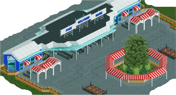
Trying to step out of my 'comfort zone'.
*will change 'park name' once I decide on a name.It's good you're trying to step out of your comfort zone,, try it with themes too,, not boring generic material.
I also believe that if you had a stronger direction and planning, you would have already decided on a park name,, if not a final name,, some idea.
I seriously doubt this gets past the entrance,, no offense,, just how I see it.Guess what? It did.
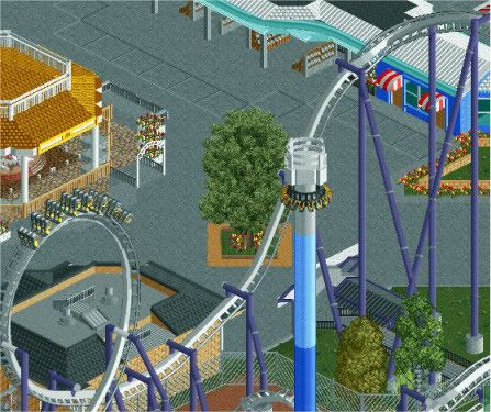
And don't worry, there's is much more on the map and much, much more planned.
I'm the reason that gave you the drive to further it past the entrance. Let me rephrase myself: You will not finish this. Now, FINISH THIS.Yea, fuck you, FantastiCo!

You're ignorant beyond words. So I'll just shut up now...:::
-

 JDP
Offline
yeah another white invert... such a shitty color for an invert. and this looks like a cedar fair style park and if thats the case white is the last color they would use (go for something more eye catching)I like that, it seems really familiar to Starpointe tho
-JDP -

 Cocoa
Offline
colorado: if you tidied up the foliage, added some trees and flowers and a few more hints of color that could be amazing.
 -

 robbie92
Offline
yeah another white invert... such a shitty color for an invert. and this looks like a cedar fair style park and if thats the case white is the last color they would use (go for something more eye catching)
-JDP
Umm, the white invert in my park is GORGEOUS and offended by your blatant racism against white inverts... Ugh.
-

 JDP
Offline
lol, rob there's a huge difference between an average white invert and something you cook up. but tell your invert i apologize for my racism
-JDP -

 BelgianGuy
Offline
fact is your invert has better a better support colour, the blue maverix chose is a little too light and isn't popping enough...
 -
 gijssie1234
Offline
WOW
 That coaster is really one of the most best drop coasters i've eveer seen!!!
good work Robbie you are 1 of the masters !! -

 Midnight Aurora
Offline
I think my point was fairly obvious.How can you tell from a single turn? I smell a TROLL

What.How he left out the last ! as a 1
-

 Wanted
Offline
I'm ignorant? lol damn. I was just completing Maverix's post for him. PoSh..................................
Wanted
Offline
I'm ignorant? lol damn. I was just completing Maverix's post for him. PoSh..................................You're ignorant beyond words. So I'll just shut up now...:::

-

 Comet
Offline
Depends on what you're going for. It looks pretty cool with the three helices up high
The second drop and last couple of turns/elements do seem awkward though -

 K0NG
Offline
Agreed. Plus, the banking at the top of the lift makes no sense to me at all. Unless the lift is more of a launch. Which also would make no real sense to me.Good first couple of elements, but then it loses it's flow and becomes awkward.
-

 Nitrous Oxide
Offline
yeah another white invert... such a shitty color for an invert. and this looks like a cedar fair style park and if thats the case white is the last color they would use (go for something more eye catching)
-JDP
Perhaps the park was bought from Paramount.
Yes, it's grey. But, I would say that a white spine with grey rails represents it better in RCT. The grey in RCT is very dark and also Afterburn can look very light grey / white at times.
Also, I'm guessing the colors go with the theme / name of the coaster. Personally, I don't see the colors a problem. But I will agree with you, Cedar Fair tends to use the same color schemes over and over... "and 80% of the time it's red everytime" lmao.. I was amazed when I saw Leviathan being a hyper/giga and not being painted red. -

 ScOtLaNdS_FiNeSt
Offline
That coaster has IVO all over it, I agree with everyone else that has commented on it. But hey whatever floats YOUR boat ivo
 Also ... Im with you Nitrous Oxide, Cedar fair do use the same colours over and over again but if it ain't broke dont fix it
-

 Nitrous Oxide
Offline
Cedar Fair owns Carowinds. Also, did he ever say his park was a Cedar Fair park? I'm not trying to be an ass, I truely don't recall if he said it was a CF park. But I understand it was not CF when it was built, I'm just giving you a hard time JDP
 Tags
Tags
- No Tags


