(Archive) Advertising District / Dump-Place
-
 19-April 07
-

 RRP
Offline
Sounds like a good idea to me.Get a photo and a topic startedjag go find me some pictures of pretty buildings and we'll make our own thread where we take it in turns translating it into rct to improve your architecture. sound good?
-

 ivo
Offline
I Really like that chocotopian! You stuff really seems to be 'hit or miss' for me. But this stuff is really outspoken. Where every piece makes a statement.
@jag: Yeah it is pretty plain. Though that church (white, blue building) has great potential! -

 Chocotopian
Offline
@ ivo: To be honest, my work is hit or miss for me as well
@ jaguarkid140: I think that each building is well done but, in collaboration with what others have said, lack a sense of purpose. Had any one of these been immersed in a complimentary theme then they would be excellent, but placed as they are – with contrasting styles and textures – they detract from each other. -

 Jaguar
Offline
Is this any better?
Edit: God Damn! Flickr doesn't work on NE. After at least 20 errors with Photobucket, here is the image: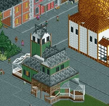
-
 coasterfreak101
Offline
I don't really understand the theme... And why are your paths always the tarmac bordered by the square tarmac? Experiment. Make a path fit the character of an area. And make the buildings do so too.
 -

 Jaguar
Offline
I don't really understand the theme... And why are your paths always the tarmac bordered by the square tarmac? Experiment. Make a path fit the character of an area. And make the buildings do so too.
It is a shop made to look like a victorian styled house of the early 1900s, and not all paths are that way, only in this area. There's a lot of brick and crazy paving also. -

 Xophe
Offline
Hmmm, not really sure what I'm looking at but it's interesting I suppose. What are the grey trees meant to represent?
 -

 SSSammy
Offline
this is how parks should be. clear thought and execution. i can clearly see every decision you made and why you made it. brilliant, i say.
 -

 robbie92
Offline
Is that a new wood object angle robbie?
Nah, those are all wood objects from Vulture. -

 Dr_Dude
Offline
I figured this was the only place to post this, I'm absolutely not making a topic. I was a member of this site on and off for maybe three years, and by, "member", I mean person who posted the songs he was listening to and was otherwise an asshole no one cared about that didn't build. I don't enjoy rollercoasters very much and never got the hang of the, probably imagined by me, "NE style" of building. Because of this I never got very far on any projects. Making things seemed like a chore. But I've been doing a lot of art for school lately, and I've found it incredibly therapeutic. Though I don't enjoy rollercoasters, I've enjoyed theme parks and this game my whole life. So fuck it, as soon as I'm done with college apps I'm gonna do the whole Bootcamp thing so I can start playing again. I doubt people are going to enjoy what I build but I know now I need to build for me.
Just thought your life probably rests on the knowledge of what I'm considering doing regarding this game.
 Tags
Tags
- No Tags
