(Archive) Advertising District / Dump-Place
-
 19-April 07
-
 ScOtLaNdS_FiNeSt
Offline
Just bringing it over
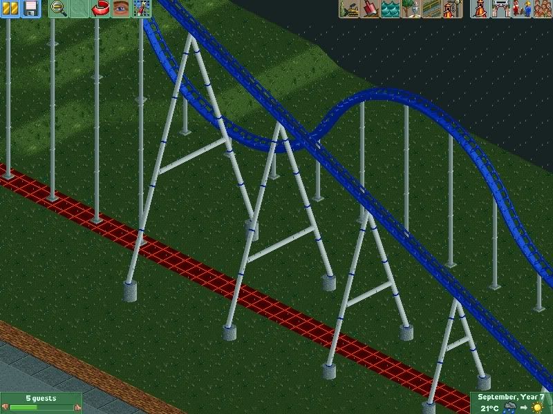
Over supported ?, The reason i put this screen here is because i thought it was under supported or the supports are weird. Generic, I was going for realistic ?. I take your point onboard but in all honesty i think its wrong I would like the opinion of others before i change anything
  About the landscape i have took into consideration and this is clearly an unfinished screen, Plus how can you tell i haven't considered the land when the coaster would not fit into five screens this size
-

 Nitrous Oxide
Offline
Leviathan's lift supports are almost identical... so how would that be generic?
 -

 ScOtLaNdS_FiNeSt
Offline
I was replying to cena and forgot the ? next to generic. Anyway so basically they are not perfect but you like them and yes realism is what i was going for
-

 K0NG
Offline
I just don't like the blue flanges. I mean, it's very rare that anyone takes the time and effort to paint just the flanges. And I still dislike that brick/concrete slab/tarmac combo. Other than that, not bad at all...for 4 supports.
 -

 BelgianGuy
Offline
if it's a hyper, spread them out more and make the come together at certain points, not all of them are alligned like this, you can also have a straightpiece down with a sloped part somewhere...
like here
http://rcdb.com/4005.htm?p=20653 -

 Xtreme97
Offline
Are you going to create a topic in the AD? Just curious, since you've posted a few images.
But the supports are quite basic. Also, I don't really like the flanges, they're ugly imo, and here they look over-used. Use just plain slanted supports. But you're improving fast !
!
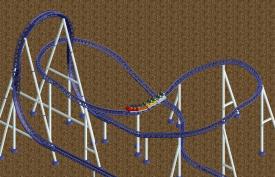
Since we're on the topic of supports, I have recently been inspired by Xcelerator. I had trouble with the Top-Hat supports so I decided to take a different approach. This isn't in any specific project but I might consider using it.
-

 Chocotopian
Offline
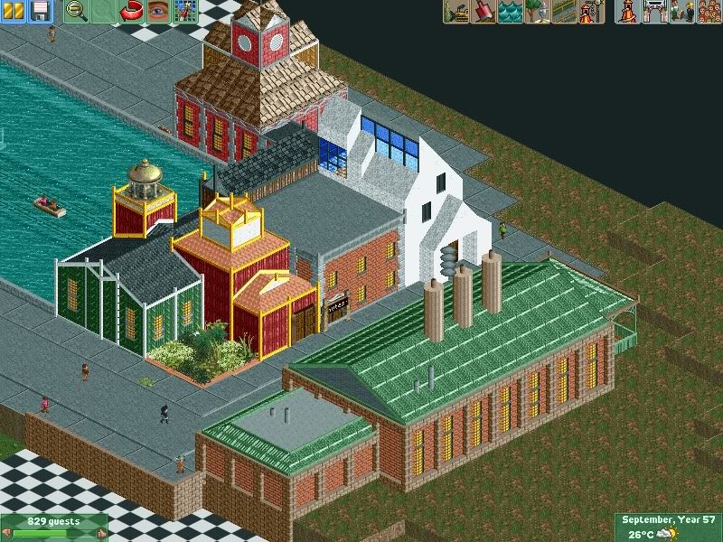
I’m very much interested by the screen on the right, Liampie. I’m not sure what the theme is, but the mix of traditional tiled-roof buildings with the elevated railway has me intrigued. Looking forward to finding out more about this.
 -

 posix
Offline

Beautiful architecture and atmosphere in the full scale screen. The zoomed out screen gives me a headache. What does this blue thing do in there? The contrast couldn't be more extreme. You're going for a calm and organic feel to then have an artificial thick blue line cut through it ... ? The buildings underneath there also look as if they have nothing to do with the ride. Is it a suspended monorail for transportation? Then it should play a subordinate role and not be given so much priority. -

 AvanineCommuter
Offline

Beautiful architecture and atmosphere in the full scale screen. The zoomed out screen gives me a headache. What does this blue thing do in there? The contrast couldn't be more extreme. You're going for a calm and organic feel to then have an artificial thick blue line cut through it ... ? The buildings underneath there also look as if they have nothing to do with the ride. Is it a suspended monorail for transportation? Then it should play a subordinate role and not be given so much priority.
Because of the scale of the buildings vs. the ride, it looks like legoland, or some sort of ride where you hover above a model city (Peter Pan in Disneyland). In that regard, it makes sense if the rail isn't the same neutral tones as the miniature city beneath it. Also, you're missing a curved block piece in the larger screen. -

 Chocotopian
Offline
A snippet of Clockwork Docks, the fourth part of the park I advertised in the Fiesta. As I said there, it’s very flashy and gaudy, and a complete contrast from the other three subdued areas. Hopefully I’ll be submitting the park this week.
-

 posix
Offline
I thought this could be what it's supposed to be after I posted. Nice idea yet still looks a bit off.
 -

 Nitrous Oxide
Offline
I was replying to cena and forgot the ? next to generic. Anyway so basically they are not perfect but you like them and yes realism is what i was going for

Sorry, my last comment was directed towards Cena's comment. But I do agree with what Kong said. -

 SSSammy
Offline
jag go find me some pictures of pretty buildings and we'll make our own thread where we take it in turns translating it into rct to improve your architecture. sound good?
 -

 deanosrs
Offline
It's not bad as it is, it's just... horrifically under inspired. Get a purpose or an idea for a building, area or park, then research, then build. That's my method anyway!
 Tags
Tags
- No Tags


