(Archive) Advertising District / Dump-Place
-
 19-April 07
-

 Louis!
Offline
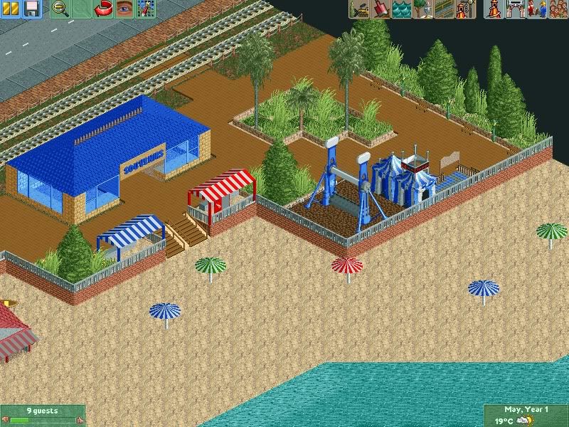
I still cant get past the horrible texture clashes within the screen.
But still, nice screen buddy. -

 AvanineCommuter
Offline
It's not terrible, but there is a lot that can be improved. Mainly for me, the coastline is a bit too linear, the planter is boring, the foliage could use some work as it's all 1 shade of green at the moment, the ride placement for the topspin is not very realistic but I don't know how realistic you're trying to make it, and the souvenirs building is under detailed and too rectangular. However, I do like the colors in the screen and the canvas tents look very cute. I see perhaps a boat rental place to the bottom left, would love to see the actual building!
 -

 Turtle
Offline
I quite like the foliage, and it's a nice little setting, but that is the world's most boring souvenir shop. Also, there's not really enough content in that screen to attract visitors...?
 -

 wheres_walto
Offline
I'm so glad you've started focusing on the game. As far as criticism, take a look at Belmont Shores, notice all the details on the beach: white water, volleyball, beach towels, rocks, and try and use some of those ideas as inspiration. And on the boardwalk itself, think more shops, less planters. Usually it's just a long strip of inidividually connected stores with occasional trees.
 -

 chorkiel
Offline
Cp6, I seem to have completely missed your comment so I want to respond to it.
First of all, thanks for the amazingly usefull feedback.
That element I made is gonna be removed, I had my thougts of it before posting but I wanted to see how it would do.
I'm gonna rebuild a lot of the track with the use of your advice, thanks again.
RRP, Thanks for the link. Too bad that map, I guess.
More thanks for the following feedback which I'll make sure to follow as well, I'll look at RCDB and see what I can come up with. -

 posix
Offline
Scotland, it's really cool to see how you're improving so fast, and yet, I think that screen is lifeless, boring and uninspired. It's like you're not convinced of what you're building there, you're just throwing it out. You need to give more flesh and blood to your creations, more ...essence.
Funny how this word just triggered my memory of a post by Ed back in the day that had quite some impact on me: http://www.nedesigns...ndpost-p-101280
2003 ... Read the topic and you'll find that history has been repeating itself every since, and pretty much on every page of the dump place. -

 JDP
Offline
^thanks for posting that dude, really hits the nail on the head.
funny thing is on that page you said you never thought youd get a 1000 posts on a forum
-JDP -

 posix
Offline
I know
That's the cool thing about having a lot of history. The past always makes for interesting or funny finds. -

 Xtreme97
Offline
I agree that the topspin seems kind of out of place. Maybe a carousel or something more fair-groundy or traditional. Also, the sea just reaches the sand and stops like that. Try and use the white-water object to simulate waves. But otherwise, you're really improving
-

 chorkiel
Offline


I think I'm slowly getting there.
Same story as usual, I'd love to improve the layout ! -

 AvanineCommuter
Offline
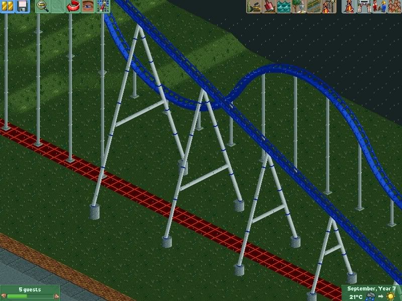
Chorkiel, that layout looks better but the way the tracks are completely parallel yet so far away from each other makes it rather... empty looking? I don't know what it is really, but aesthetically it isn't the best layout I've seen.
 -

 chorkiel
Offline
Sammy, The inspiration for making this layout comes from RRP's layout for the NEDC.
For further inspiration I mostly took advice and kept a lot of images of coasters (and NE-designs) in mind.
AC, thanks. I think I get what you mean. Looking at it, I know it needs changes especially the part where it turns back to the station isn't as you said 'aestethically pleasing', so I'll try to change that.
I'm kinda not aiming to make it the best layout ever since, this will just be a learning project to me, to (as posix would say it) develop my skill as a player. -

 Cena
Offline
No, I don't like them, way too generic. Also you build a coaster, without think about the landscape. Also it's over supported.
 Tags
Tags
- No Tags


