(Archive) Advertising District / Dump-Place
-
 19-April 07
-

 mardy
Offline
@ac: Awesome, my friend!
@Disneylandian: Amazing. I agree with Steve that it need some benches and stuff though. -

 chorkiel
Offline
I don't like the roofing on the upper-stairs, it seems too messy.
Other than that it's great ! -
 rct2isboss
Offline
Still way to short and the turnback looks insanely deathly. The ending also is pretty bad. It lacks flow and the speed seems super fast for the small layout and turns at the bottom of the hills.
 -
 ScOtLaNdS_FiNeSt
Offline
I would just scrap it chorkiel and start over, It just doesnt have flow and looks awkward
 -

 chorkiel
Offline
boss, I did think that turnback (you mean the thing twisting through each other I guess), looked weird but I wanted to test if it would be sufficient.
about the speed, it's not that high really. Usually on top of hills it's at about 17mp/h and down it differentiates per hill.
Scotland, are there pieces of this especially that make this look awkward to you or just this as a whole thing? -

 ScOtLaNdS_FiNeSt
Offline
Yeah as i said before that weird twisting element, I have never seen anything like it on a real woody but thats just me, In my opinion it just isn't something you would see on a coaster and i dont like it. The whole layout just looks akward and that element just emphasises it
 Thats why i think you should scrap it and start over or if you want to improve this after the first drop instead of a banked curve make another hill and then the banked curve because something like that would give you brain damage your head would rattle like a letter box in a hurricane. But Keep going and you will get it right
Edit: I built this in 2 minutes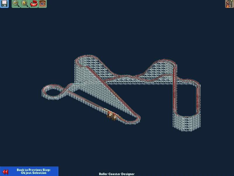
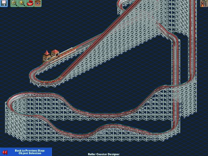
I think thats more what your looking for -

 ScOtLaNdS_FiNeSt
Offline
Course he can build whatever he wants ... I didnt say he couldnt. He was asking me why dont i like it and i explained and then posted those screens, Just tryng to help sheeeeeshhh !
 -

 CedarPoint6
Offline
chorkiel,
Your coaster is suffering from an identity crisis. It wants to be an out and back, but in the middle it suddenly has twister elements. Consider the general out and back which is expansive, but usually goes out and come back side by side. It has hills and any turnarounds are usually done high up and pretty flat as you have. You don't see many corners except to get it pointed in the right direction. Twisters on the other hand tend to be more compact. Even if they are more expansive, you see them having a lot parallel track or not things which will criss-cross in every direction. The twister is more about the diving turns and things you have in your little section in the middle. That said, even this element might be a little extreme for a twister. You have a tall 270* diving corner gathering quite a bit of speed before suddenly banking in the other direction and going back up 270*. As a guideline for my coasters, I tend not to use these kind of long diving corners as they're pulling a lot of forces by the end. Unless you can make it wider at the bottom or somehow level it out in the middle, it might be something to avoid. Also take not in that it only interacts with itself and is pretty much an element on its own. You might try to integrate it with the other elements of your coaster... before and after that section of the layout so it shows that you've put thought into what will happen later in the ride as you're building the first part. It should be a planned thing-- not a hill goes here and then you decide what's going to happen next right then. Have a general idea of you want the coaster to do this, this, and this before you build it.
For your coaster, it seems like it wants most to be an out and back layout, so you have lift, turn, drop, angle, hill, turnaround. Here is where you might consider other things-- maybe go another hill before that turnaround-- or a low airtime hill-- it doesn't have to be as high as possible. But once you turn around, it's time to integrate. Point it back towards your existing track. Maybe you can make the return run of the coaster run on the square next to the 'out' run. Then as it goes back with lots of little airtime hills. At the end, you might consider ending with a helix to get it going the right way. If not, a turnaround corner like you have might be fine. And if this out and back is too boring, then try spicing it up some.. See Wild One (http://rcdb.com/148.htm?p=6235) for a turnaround that does something more interesting than making it flat.
Hopefully this will help things out a little bit. Pick a coaster with a style you want to emulate, find other coasters that do similar things, and then try and combine your favorite parts into the coaster. -

 RRP
Offline
Chorkiel: try bing maps ie http://www.bing.com/..._Boss&encType=1
And i echo what CP6 said.Try and decide what you want your coaster to be and do before you start building. Is it a classic ride designed to look like it was built years ago? If so looks for ideas on old ride layouts. Maybe you want a signature element on a modern ride like the twisting element youve built on your layout? In which case look at recently built rides and decide if it would work or be too extreme. If the latter, maybe you could still still keep the element shape but split it into to part with other elements between making it less extreme. -

 Nitrous Oxide
Offline
I'm acouple days/weeks behind but this is fucking amazing! Seriously can't wait to see some more screen shots. -

 AvanineCommuter
Offline
Unique theme, love the ice blocks and the architecture, the support track is well done too! Anticipation is building! Not a fan of that tag though, just from what I see from the previous teaser and this, "On the edge..." seems too generic and not really adding anything to your project.
 -

 Cocoa
Offline
other than the blue rock things, (left- middle) it's a great screen. although maybe a little cluttered.
 -

 deanosrs
Offline
I'm not sure what the theme is? The ice things don't seem to go with the building. I would have guessed chinese if it wasn't for them. Maybe the surroundings make it clearer - great support work too!
 -

 Phatage
Offline
I like the execution on the thicker supports. Can't really tell what the theme is atm but unless what you used goes along with it, I say change the queue line shade covers to some other, more aesthetically pleasing material/color. With those supports though, have you experimented with coloring parts of it differently, say as to create a stripe down the length of the support? I'm not saying something like that should be used in every support (but it might work), but it might be cool to see on the tallest ones and add an illusion of added height to them (not like they really need it though). Recoloring now that you have them built though might be tricky.
 -

 AvanineCommuter
Offline
I think the theme is Mongolian or Tibetian or something. Probably some abominable yeti of some sort.
 Tags
Tags
- No Tags


