(Archive) Advertising District / Dump-Place
-
 19-April 07
-

 BelgianGuy
Offline
I actually think the scale is spot on, it just needs thousands of peeps going through that plaza, in real life disney parks there is this much path just to be able to keep a decent flow of people going through the main street... waht this screen lacks in basic is the element of a large crowd, peeps would make this screen complete
 -

 Kumba
Offline
Oh and...
Opps... wrong game... goes WAY faster than RCT tho. Can make a whole city in a day or two
-

 Liampie
Offline
Steve!? What is happening?? I don't understand!!!
edit: I wanted to say I'm pleasantly surprised with these screens. Nothing amazing but I'd definately like to see more.
-
 coasterfreak101
Offline
Oh man. I love that, Steve!
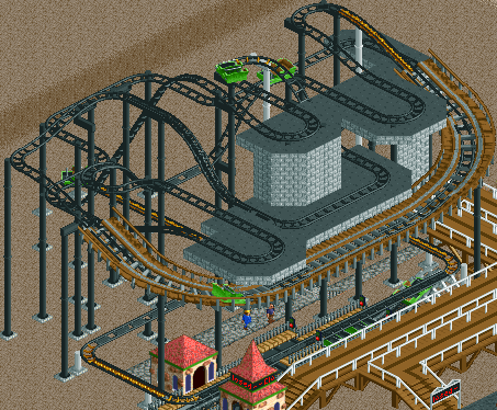
Kong too - the original's facade looked fantastic, and the inside layout looks great too. Excited to see this again! -

 robbie92
Offline
Haha, nice Steve. I'm guessing the bench's working for you then?
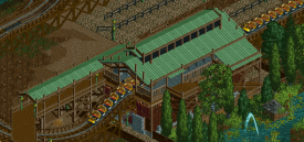
Oh, and great job on the station. The addition of overhangs really livened it up. -

 posix
Offline
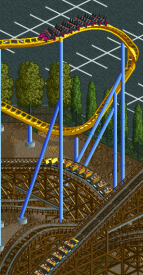
Loving the first screen for its fantastic colour harmony minus the few too many spiked trees. The second screen is a bit off for me. I guess you wanted to go for this strong contrast, but I don't think it works well here.
 -

 Pacificoaster
Offline
That station looks great Steve. I also like the diagonal exit path over the first turn.
 -

 Steve
Offline
Thanks dudes, glad you all dig it. I asked Rob for advice on the station and it really did bring it up a few notches, so thanks man.
Turtle, yeah now whenever I am home from college I try and squeeze something in!
posix, thanks! Any suggestions for a smaller yet still powerful contrast? The idea is that this is an older wooden coaster with the park building a brand new hyper coaster around it, and I liked the idea of that. Pipe in some ideas if you can, dude! -

 K0NG
Offline
Love that first screen Steve. Everything about it just oozes fuck yeah.
@Cocoa - The main reason that I decided to re do this is that because it was a secondary attraction on the NEDC map, I'd built it well into the corner. With it being the main focus now, I thought I needed to give it some breathing room. There were also a couple of minor things that I wasn't real happy with that I didn't think I had the time to change with the time limit before that I can try to perfect now. -

 gir
Offline
Steve! I love it. That station has such massive character. Very outdoorsy--it makes me want to take a walk in the woods.
 -

 Brent
Offline
Steve, you never let me down (nor do you give up on me) with each and every screen you show. Like I really need to say this, but, keep up the great work.
 Tags
Tags
- No Tags
