(Archive) Advertising District / Dump-Place
-
 19-April 07
-

 Roomie
Offline
Well today is the first time in ages ive been able to sit down and play RCT,
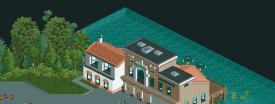
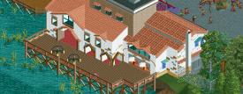
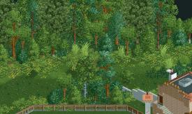
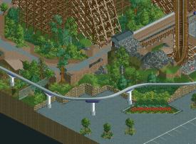
Still only managed a couple of hours but here is a couple of very unfinished screens

-

 robbie92
Offline
Love love love love... It's starting to look like a fun vibrant mall now, which is awesome. However, in the first screen, it may be cool if you possibly got rid of the planter on the right, at the very least, and make an outdoor dining area for a restaurant. Make it an area where people'd want to linger...
 -

 Dotrobot
Offline
And also in mall entrances I think it'd look better if you didn't press the parking lot spaces so close to the entrance
 -

 AvanineCommuter
Offline
I am LOVING the trackitecture Roomie. I am always looking to you to push the envelope with trackitecture!
 -

 5dave
Offline
^Maybe when I can find some time again.
Started a design before the design challenge that I want to finish sometime this year.
"MFG" -

 Liampie
Offline
This is the first time in years I dislike what you've done. The building on the left just doesn't look good, why the bright white texture? It's got a weird shape too. Also the mold style foliage doesn't really fit here in my opinion. You're great with foliage with what you're doing, but I wish you were trying something else for a change.
The large building is pretty much flawless however. -

 Liampie
Offline
It makes more sense now, but I still don't like the texture. I think normal white will look fine here. The backside of the building is otherwise fantastic! Something else that bothers me about the front is how the facade extends outwards twice, resulting in a useless strip of black. If you push the lower half of the building one quartertile back it'll make much more sense.
As for the foliage, I don't like the transitions. Your foliage always has these smooth transitions with lots of grasses and stuff, and since Castle Howard everyone's doing it. Thank god you're using different objects this tiem, but yet I can't help but feeling you always do your foliage on autopilot, never considering other types of foliage. In the first screen such unkept foliage doesnt't fit the tidy surroundings, and moreover I think everything is looking quite bare and you're not using the opportunity to fix that with foliage. Some examples from Piraña, I think I did it quite well there:
Here I made a large open space much cosier by tactical placement of one or two trees.
Another more subtle example, the planter in the top right corner. A single tree bridging the gap.
In your case some higher foliage, even a single tree, could mask the bareness of the area. Literally embrace the area with trees, also offering some shade for the guests. And you don't have to cover the tiles surrounding the trees with weed again.
RRP transitions:
Abrupt transition:
In the second new screen I think the latter type of foliage could look better, or at least reduce the contrast between overgrown areas and open areas. The third new screen looks great to me, the foliage is spread much more evenly.
But in the end it's all a matter of taste of course. No absolute truth. -

 posix
Offline
Reminds me of that gorgeous wooden you did in your park war's entry with Blitz. What was that called again? Can't seem to find the SV4 right now.
I think the last screen is pure class. Love how you've used the fence as a wall. The others are "okay". I think your foliage used to be more organic at some point. This trend of creating strong green lines Kumba made popular only worked once in my opinion, in his design, and althought I don't believe you're following it purposefully, it does look very similar, and doesn't quite work here.
I love how you try to add some simplicity to your architecture and go against the overdetailing style many people follow with architecture lately. It works and fails at the same time I think. It looks as though you took too long on that one building, so its purpose has emerged over time and the end product as a result is a bit unclear. -

 Luigi
Offline
I'm with geewhzz here, there is some amazing stuff in the screens. I agree with Liampie though that the white is a bit too bright.
 Tags
Tags
- No Tags

