(Archive) Advertising District / Dump-Place
-
 19-April 07
-

 SSSammy
Offline
I don't think anyone (else) got this, but I laughed.
reddit killed it for me. literally 100's of submissions with plays on "nope. chuck testa."
it was hellish. -

 K0NG
Offline
^^SSSlammy, where'd you get that GIF of gee?
Coupon...good things come in small packages. Other than the foliage, that looks nice. -

 F0ndue
Offline
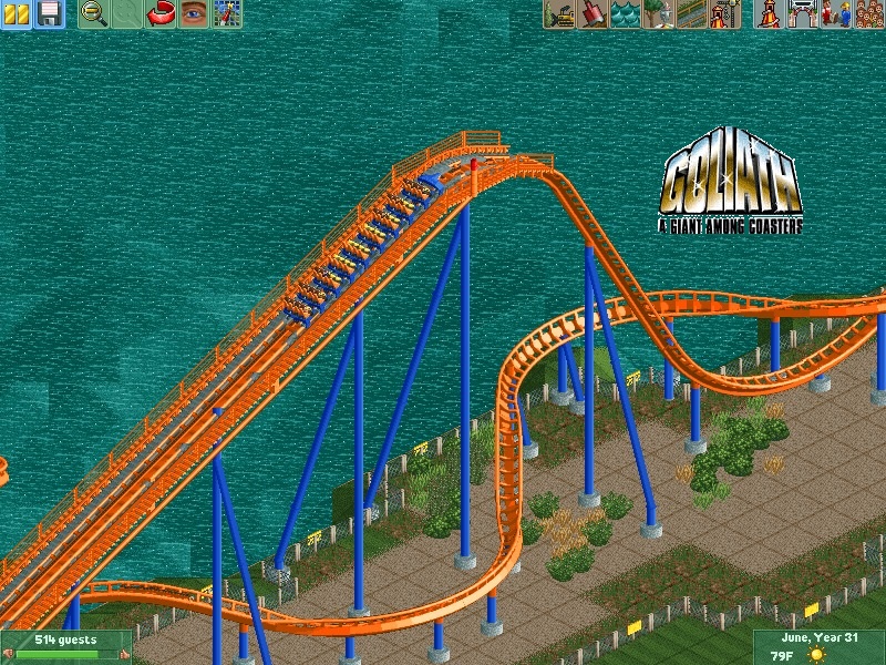
Sweet,haven't seen many B&m mini Hypers so far,but this looks great.Funny enough,the title under the Goliath Logo: " A giant among coasters"
 -
 coasterfreak101
Offline
Exactly what Kong and Fizzix said. Looks great as far as the ride and setting goes, but the foliage could definitely use some work.
 -

 Timothy Cross
Offline
I think you've become quite good, and you've come to quite a mastery of really building to make things as if they would actually work, but you need to give park guests a better sense of theme and atmosphere. WhatUgoz right now; it looks great to the RCT viewer, but it would look even better to the viewer if it looked better and more inviting to the guest. -

inVersed Offline
Coupon thats a little short for a B&M mega coaster. It certainly feels less than Goliath -

 Timothy Cross
Offline
yeah coupon, it's kinda an oxymoron. Your logo gets contradicted. And get rid of those green bushes/ shrubs (forget what they're called, they're the vanilla scenery object foliage in the screen).
-

 Comet
Offline
That looks great robbie, I was just at Busch Gardens today and I think you pulled that off really well
I just think that you can pick better colors for the trains though -

 Fizzix
Offline
Yeah, orange harnesses and either yellow, gold, or orange for the actual cars would be better, imo. Great screen, though. You consistently wow me.
 -

 Nitrous Oxide
Offline
Goliath from Six Flags Washington! (Yes I know its small....)
Wip..
Love it!
"^^SSSlammy, where'd you get that GIF of gee?"
lmao -

 K0NG
Offline
Dunno, Rob. Unless that's a re-creation of something I've never seen (which might be the case considering the previous replies) I'm just not feeling that at all. If it is...I personally would have done a "this is how I'd like to see it" version instead of re-creating something that just doesn't look good to begin with.
And, Cross.....man, stop just making up words. I question your "sobriety" more with every recent post/sig you come up with.
Unless, of course, God told you to act freakish again...in which case it's understandable. -

 Luigi
Offline
Wow Robbie...that's the first screen I see with the rock wall where they actually look good.
 -

 Comet
Offline
No I just meant he pulled off the Dive Machine details very well
That's not a recreation
 Tags
Tags
- No Tags
