(Archive) Advertising District / Dump-Place
-
 19-April 07
-

 Coupon
Offline
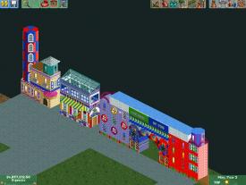
The problem is that there is a red building right next to it... Plus I dont want to copy Hillsburg's.
-

 K0NG
Offline
^Agreed...maybe try to mix some grey in there to break up the drastic orange/black contrast.
 -

 chorkiel
Offline
@School jin, get a topic. You deserve more attention for your creations..
@coupon, That orange building is looking great, but that color hurts my eyes.
for the merry-go-round, you could just experiment with colors, blue might do, i think. -

 Liampie
Offline
@coupon, That orange building is looking great, but that color hurts my eyes.
Contradictio in terminis. -

inVersed Offline
Your getting good, coupon. My only real complaint with that screen is the lack of depth considering its extremely flat right now -

 RamSam12
Offline
I was hoping to finish this before posting, but I think it's better to be posted today. For those who don't already know, Ron Toomer of Arrow Dynamics passed away today at the age of 81. Now, before it hits midnight in my time zone, here is an Arrow suspended, to honor his memory.
-

 Luigi
Offline
That looks like a nice tribute. Hope you can finish it, as we don't see enough of these suspenders released on this site.
 -

 highroll3r
Offline
Looks awsome RamSam! Btw can you link me the newly aligned object for the supports? I need!
 -

 Flap
Offline
I like it, but i think the red one isn't well placed in the colors of the other buildings.
 -

 DictatorOfFrenchToast
Offline
I think the windows on the dark brown building should be a lighter color. Looks too bland to me
 Tags
Tags
- No Tags


