(Archive) Advertising District / Dump-Place
-
 19-April 07
-

 djbrcace1234
Offline
Very cool, but very odd at the same time. I don't see the reason behind the coaster, but I love the city life atmosphere you created. Well done!
Anyways, this is what I have been working on the past week:
-

 verti
Offline
djbrcace1234; I really like the building in the top right of that screen, but the rest doesn't really do it for me. The colours make most of the architecture blend together, and with the crazy paving path it doesn't have much to contrast against either. The coaster blends in as well.. Maybe add some more vivid colors, like a brighter coaster track or such?
 -
 Flap
Offline
@dj brace, Looks good! verry classic but i love it!
@Coasterfeak, Making the premier coaster "The Mummie" from universal studio's?
Really get that Atmosphere when i look at your screenshot.
@School_Jin, What a Wonderfull Atmosphere you have there!
Really like to see more of the Huge Rapid! -

 Liampie
Offline
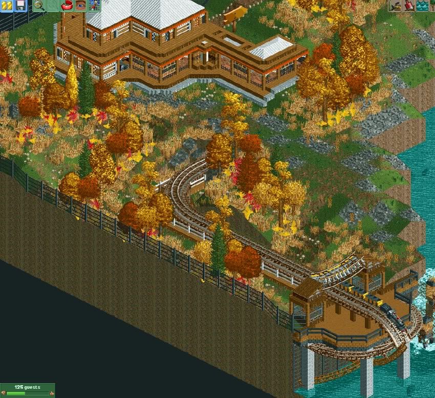
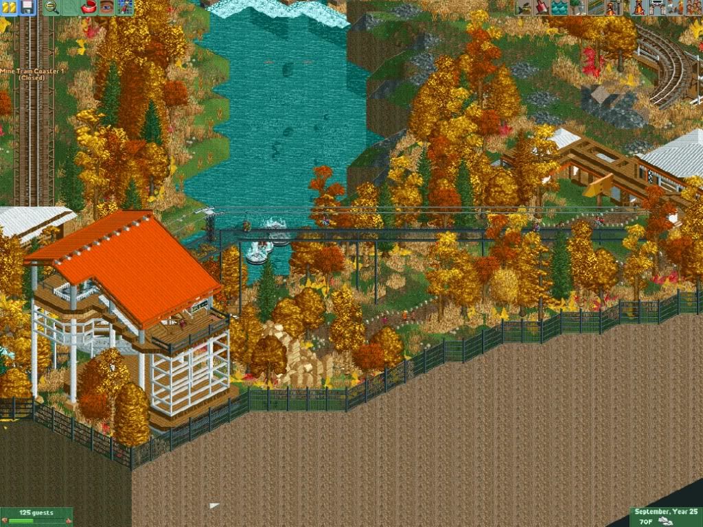
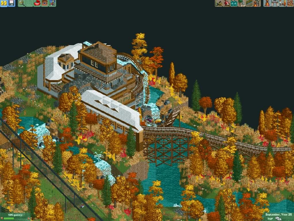
The first time I ever saw a convincing fall theming done in RCT. Kudos to you, sir.
Agreed! It works here! Unbelievable.
-

BigB Offline
Very nice fall pictures
I have something new to:


I'm not sure about this?
Should I delete it and built something new?
There's a haunted mansion in it.
Greetings
B'B -

 Fizzix
Offline
No, keep it. Just raise the land around the waterfall 1 block so the water doesn't look like it's about to overflow.
 -

 RCTMASTA
Offline
I've always found it amazing how all the Korean parkmakers seem to be so easily able to "think outside the box" and create conceptual or fantasy parks that seem to pop off the screen and, even though some parts are fantastical, some parts are also realistic;
With the autumn screens, it may not look very fantastical, though there is an element or two-the coaster train; a Miniature Railroad, that's new ; hanging off the bridge and about to fall into the river-of the realistic, there is plenty of, such the atmosphere that seems to radiate off the screen when I look at it, though it still feels like there's a fantastical, almost conceptual, touch to the entire thing. The conceptual...I admit there's hardly any of it, but they're amazing screens nonetheless.
With the cityscape screens...wow. Just Wow . The ultra-modernism, the conceptual look of the office buildings, the street markings, the fountains, the lobbies, the cafeterias, the peep scenery in the buildings...it all blends together to form that incredibly complex mix of realism, fantasy, and concept, that makes you want to go "wow" every time you look at it.
It's got conceptual realism, it's got ultra-modernism that's got an air of the conceptual, fantastical, and realistic that seems to stimulate the senses, and yet still look quite easily plausible on the real world.
It's really beyond words. Except, Wow.
It's an incredible blend of realism, conceptual, and fantastical art that seems to blow your mind each time you look at it and makes you see RCT as more of an art form than a game.
To put it simply Jin- damn; that's fantastic!
-

 BelgianGuy
Offline
wow good screens,
DJ, I suggest trading the monorail in for a train tbh, I think a monorail is often used to get a birds-eye view of a themed area or so to offer more of the theme than the view from the ground, here you do not utilise this feature as the monorail doesn't even go close to the themed area, you apply it as you would use a scenic railway around the park where you'll have more chances of the railway going through a part of the landscape rather than through a part of a themed area of the park.if you still want to keep the monorail I suggest letting it go under the zero-g roll as it then offers an interaction point with the entire area and a key feature of the ride that is most prominent in the area you're going through.
for the rest the screen looks good but maybe consider what I just said, it may or may not work in this situation but I think it's worth trying. -

 nin
Offline
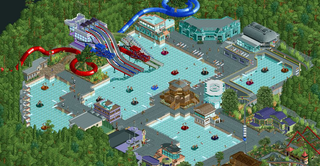
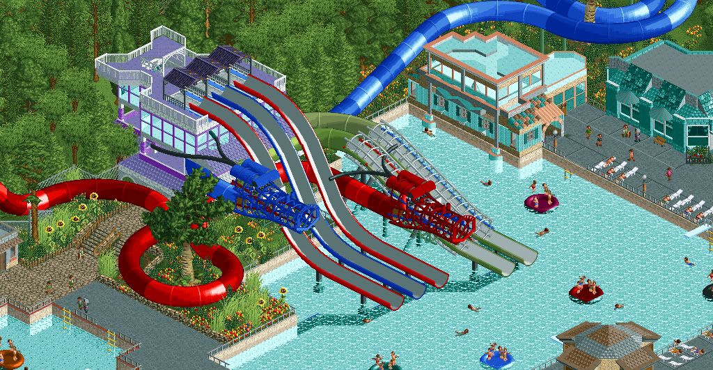
The main flaw in those two screens Miracle is the lack of foliage diversity. The waterpark is beautiful but the "all bright green" surrounding forest is bringing it down a bit. Green is such a powerful color, diversify it a bit!
Oh, and I'm sticking with the "best screen in the Dump in a very, very long time" mentality here. -

 Brent
Offline
Have you been to Korea nin? It's literally ALL green trees... everywhere you look. And tons of hills. It's crazy, lol.
 Tags
Tags
- No Tags

