(Archive) Advertising District / Dump-Place
-
 19-April 07
-

 Bolliger & Mabillard
Offline
Yes. I like your NCSO K0NG. It reaches out to me in a special way.
Wait.
I thought you were working on your new design after Vulture. I've been cheated out of my time!

-

 Louis!
Offline
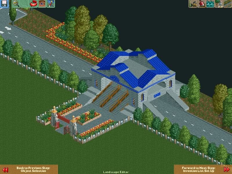
Why does every building use that fence as a trim?
I do like the screen though, its real nice. -

 posix
Offline
Good stuff K0NG. It's almost a bit too "full" for me. Everything seems covered or as though you intend to cover it with stuff. It makes your style a bit "overloaded" for me. I'm impressed by your endeavour to go for NCSO, and I would hope you might think that it's a bigger challenge to play the LL way rather than just using CSO.
I would probably make the paths bigger because it's the entrance plaza, and plaza's tend to be wide. To not just have it all full with paths, I would break it up with little parts of greenery or trees. Things that welcome guests, allow to sit down, signs that show waiting times, services such as lockers, toilets, lost & found office, etc.
Not sure what the monorail is for there. But it looks nice. What is it?
I would also suggest that you build a clear theme somewhere in the park, if that shouldn't be your aim already. As of what I've seen from you so far, every building is always too individual in my opinion and screams for the viewer's attention in an almost competitive way against other buildings. It would be nice if things could be a bit more in a sort of "global harmony" and swing with one another. Hope that makes sense. -

 verti
Offline
Not sure what the monorail is for there. But it looks nice. What is it?
Really? I immediately thought they were little seating area's. -

 RRP
Offline
Looks good except the buildings Kong.You've got to much crap on top of shapes that are not very appealing
 -

 Liampie
Offline
I would also suggest that you build a clear theme somewhere in the park, if that shouldn't be your aim already. As of what I've seen from you so far, every building is always too individual in my opinion and screams for the viewer's attention in an almost competitive way against other buildings. It would be nice if things could be a bit more in a sort of "global harmony" and swing with one another. Hope that makes sense.
My thoughts exactly, with all of your work. -

 chorkiel
Online
That purple building is ugly, just really ugly. The colors are so.. NO!
That castle looks good though it looks weird because the station is sticking out a bit.. -

 Dotrobot
Offline
better. just let the roof run through the middle though. That middle gap looks ugly as hell. also make the entrance area bigger. there's no way all those peeps will fit in those single tile paths or better yet through that small gate
 -

inVersed Offline
How many parks have you been to that have anything remotely that small scale and awkwardly laid out for a park entrance? -

 ScOtLaNdS_FiNeSt
Offline
So just fill the gap with roofing, The whole roof or just the extended bit in the middle ? ... Do you think i should change the type of entrance or should i add another gate .. I dont know if you can change the entrance type at this stage ? And that wouldn't be my full entrance i was planning on making a entrance plaza after the front gate(s)better. just let the roof run through the middle though. That middle gap looks ugly as hell. also make the entrance area bigger. there's no way all those peeps will fit in those single tile paths or better yet through that small gate
Inversed : It is going to be a relatively small park nothing special just a bit bigger than my first park, Im looking at 2 maybe 3 coaster's and other attraction's ... Thank's for your reply guy's
-

 Dotrobot
Offline
The whole roof. And think about it. For peeps to get to the entrance plaza they would have to go through that small ass gate and crowd up
 -

 ScOtLaNdS_FiNeSt
Offline
The whole roof. And think about it. For peeps to get to the entrance plaza they would have to go through that small ass gate and crowd up
Yeah so add another gate or a suggestion from you please ?
?
-

 Dotrobot
Offline
get rid of the gate and the middle planters. Have a 3 tile path without the gate that leads into a plaza. Then place the gate in the plaza or place the gate in a entrance building
 -

 ScOtLaNdS_FiNeSt
Offline
Ok ,What do you think if i place the gate right at the edge of the map just before the bridge ?get rid of the gate and the middle planters. Have a 3 tile path without the gate that leads into a plaza. Then place the gate in the plaza or place the gate in a entrance building
 Tags
Tags
- No Tags


