(Archive) Advertising District / Dump-Place
-
 19-April 07
-

 Flap
Offline
^how would that become a mess ? :S
It's kinda the same as in bobbejaanland only are there way fewer ticket boxes
Try to Think the IAPAA way, There is no line for guests who already buyed a ticket at the paybox, so you need to go back in the same line, Where is the Group ticket box?
Do you know hpw it feel to get through a line of people waiting when you already bued something...
It Called infrastructure or something like that.
Keep that in mind by building a Entrance. -

 chorkiel
Offline
^I honestly have no clue what you're saying, can you explain me in dutch because I'm kinda interested in how that wouldn't work out..
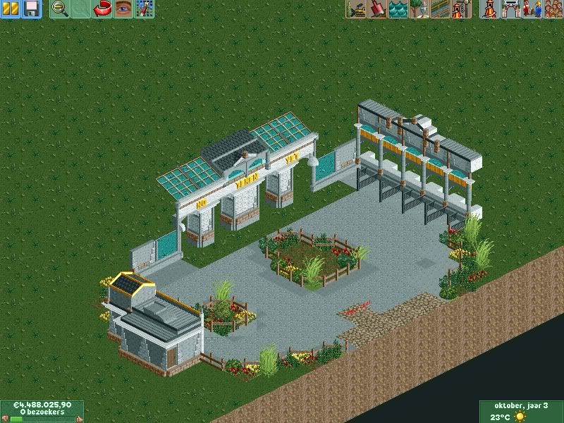
@bignate, I love your supporting work. But I highly dislike your architecture, it's WAY too blocky and uninspired. Try adding more details and shapes and such! -

 Flap
Offline
Kijk, het punt wat ik probeer te maken, is dat de infrastructuur van de kassa's niet erg logisch is ingedeelt.
gezien je nu langs dezelfde rij het plein opmoet, wekt chaos op. -

 RCTCA
Offline
Insanity - that screen is GREAT! Fantastic work..
EDIT: Hmm, it appears today marks the 6th year I have been a member here! -

 nin
Offline
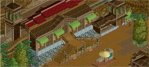
While it's very brown, it's much better than your more recent stuff as it shows change and progress. Very nice. Be careful with the brown path as that particular shade (the dirt) looks a bit gross, though that's more personal taste. You also may want to let the inside of your station breath? It seems very closed up at the moment (looking at where the track exits)
Insanity, that screens is very good and fun-looking. I enjoy the clouds on the buildings ( ) and the tan/purple mix.
-

 gir
Offline
It's nice but there is something odd about it. The station is shaped a lot like a diner--so much so that it's the first impression I get when I look at the screen.
 -

 Liampie
Offline
Good idea, but in my opinion there are too many trees blocking the view. Reduce the tree density!
-

 chorkiel
Offline
Flap, I get what you're saying. In bobbejaanland it's working because that isn't right in front of the entrance.
Mardy, listen to flap.
maverix, that's awesome !
gir, not a fan.. it's like those shops in the queue at the efteling, they're only blocking other people that wanna walk further and people are easily gonna kill the line. -

 gir
Offline
I think you're right, but it was worth it to sound out the idea. In the end, I'll probably replace this with some other form of entertainment and place the archery range away from other peeps.people are easily gonna kill the line.

-

 Liampie
Offline
gir, not a fan.. it's like those shops in the queue at the efteling, they're only blocking other people that wanna walk further and people are easily gonna kill the line.
Which queues are you referring to? -

 chorkiel
Offline
^droomvlucht, joris en de draak, especially the droomvlucht, people keep cursing at each other and killing the line and such.
^^The idea to not bore people in the line is great! but you can do that with great themeing as well. -

 Louis!
Offline

It's very unfinished. i know. I was really impressed by myself and i needed to share this with the community.
comments will be appreciated.
What's that on the bottom left?
Both brilliant screens. -

inVersed Offline
insanity that screen is wonderful. Maybe touch up your foliage a little bit, but besides that it is great
 Tags
Tags
- No Tags


