(Archive) Advertising District / Dump-Place
-
 19-April 07
-

 Flap
Offline
Tip: To make sure you get more airtime make the tops of your Coasters short, and let the starts and stops on your hills be the long track.
And, if you build in our park, Please build on a other location then the Mainstreet lol
@SuperG, i already said in personal, Your Layout is Really Great! Hope some could support it for you. -

 Luigi
Offline
Hmmm.... sorry, but I don't really like it. The buildings in the first screen are waaaaay too big compared to the surroundings. They could also use some details, since they are not really interesting to look at. Furthermore you should put another ground texture underneath your paths and your foliage could use some work.
The second screen I would give the same advice...Though I really like the supports here. -

 Luigi
Offline
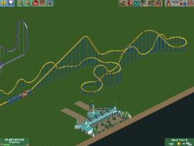
I don't know too much about this types, but I have never seen such a big first drop. I do really like it though and I actually don't care if this is possible in real life or not
Looks really great, hope you can finish this. -

 gir
Offline
^ Not far off from Big Bad Wolf. One of my all-time favorite drops on a coaster.
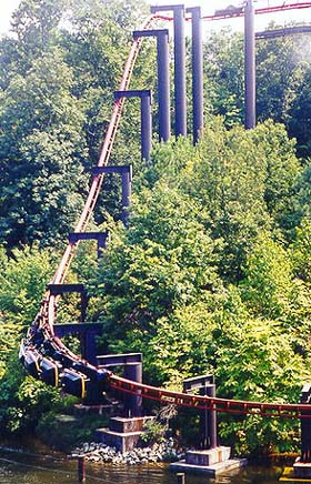
I really like it nin; it's simple yet elegant, and the layout flows well. -

 posix
Offline
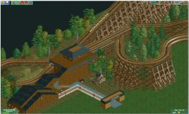
Let me be the wise-ass I like to be and suggest that it's because of the amazing interactions of terrain, layout and queue, done with the right amount of space between things to appreciate them instead of being overwhelmed by them, and about that, nin, i am especially happy, as you have always overpacked things to my liking recently, and, the fact that the cliff is designed in such a way that it "presents" to the viewer's eyes what there is to offer like a stage wall, and, because the colour combinations and terrain shapes work really well because they are organically and tastefully chosen, making this a really really wonderful screen.that's so god damn beautiful and i don't know why.
good job nin! more of this please. -

 Flap
Offline
Why are all thoose old Arrow coasters getting Removed
 ,
,
Well seems a Really good Start! -

 chorkiel
Offline
Coupon, that's beautifull !
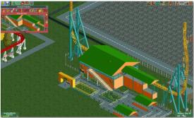
xJur, that could be a really nice entrance for a parking lot! for a theme park it's to simple. -

 nin
Offline
Still needs the ice cream cone
And thanks everyone for the comments above, I may have to either expand on this or try another Arrow
-

 xJur
Offline
You already had an entrance?
I've got two of them, one in the back and one in the front, this is the one in the front,
 Tags
Tags
- No Tags
