(Archive) Advertising District / Dump-Place
-
 19-April 07
-

 Cocoa
Offline
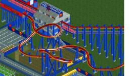
@stormrunner: make the teal walls actual windows (or just put windows over them) and then I will love it.
 -

 F0ndue
Offline
Storm Runner Fan:
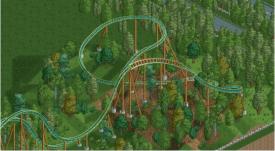
Looks absolutely gorgeous,but I don't like it that this turn is unbanked. -

 Jaguar
Offline
SRF, I love that screen, but those cars are ugly. Use LIM coaster cars instead, it'll look better.
 -

 wildroller
Offline
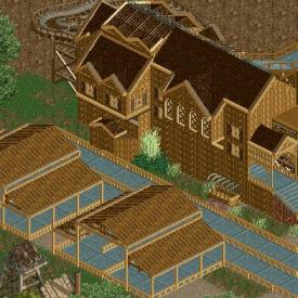
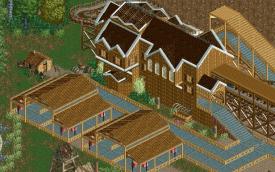
@flap - That entrance is really nice, the only thing I see is the one tile wide section leading to the entrance! Would look much better if you had a wider path on the map edge!
 -

 Flap
Offline
@flap - That entrance is really nice, the only thing I see is the one tile wide section leading to the entrance! Would look much better if you had a wider path on the map edge!
The problem with that is, My Guests cannot come into the park anymore. -

 Luigi
Offline
@ Flap: I'm not a fan of the supports on the roof, other than that it looks nice.
@ SRF: AWESOME!
@ Xcars: It needs some colors and some more life. It is very dull at the moment. -

 Flap
Offline
The inverted, or Flying coaster looks Really awesome the Station.
Colours of the Intamin Giga, or Mega Coaster, looks also Really good! -

 musicman
Offline
both screens look good, but I'm not sure why you used different supports on the flyer. The landscaping also looks underdetailed, which I hope won't last long.
 -

 Flap
Offline
Trying to make a GCI Mountain Flyer inspired by coaster?
Looks good for now, Whish you much luck doing the Supports.
 Tags
Tags
- No Tags

