(Archive) Advertising District / Dump-Place
-
 19-April 07
-

 Hex
Offline
Just to give it more colour. My ideas are dead since the anesthesia has worn off. I don't know if that's a good enough excuse.
 -

 Insanity
Offline
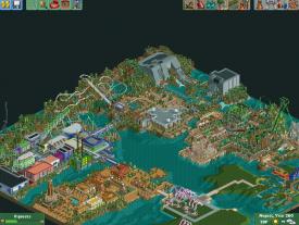
Nice, but as said beefore, you need more color, perhaps change some of the dark walls to a dark purple.
 -

 Cena
Offline
explain the foliage on the roof !
It's a hidden marijuana plantation. Brilliant idea I must admit, a themepark already has such a large power bill, this little bit for the marijuana won't be noticed (Although peeps can see it from every coaster and observation tower ...)
-

 nin
Offline
Very nice. I don wonder why the ride would be so far back, with no good way to see it in action from the mainway. I do love the color scheme for the area, one thing that ncso has which cso tends to not is this mix of natural, vibrant tones mixed with 'artificial' color from the shops and such.
-

 Luigi
Offline
Wow, some nice looking stuff there. The green coaster on the right looks great.
Good luck on finishing this. -

 Liampie
Offline
That looks great! I'm afraid however that it looks less good zoomed in... Make sure the foliage is better this time!
-

 Flap
Offline
I don't like thoose huge grey buildings on the right side on top.
It come over to me like huge grey concrete Block with no such thing as only the concrete and nothing special.
The rest looks Really awesome. -

 hulkpower25
Offline
thanks guys.its just the with the building there not much else i could use. its poseidon's fury show
i will post more screens zoomed in on each of the islands. -

 Cena
Offline
If you really want to score high in your ImagiNations contest entry, then start with making objects, because all the glitches in this ruin the great building ... Nice screen though, but you can do better.
 Tags
Tags
- No Tags


