(Archive) Advertising District / Dump-Place
-
 19-April 07
-

 Cocoa
Offline
Other than the ww/tt problem, I really enjoy this screen. I also enjoy the rest of the park, I think I saw it on TPR. You should start up a proper topic over here.
 -
 highroll3r
Offline
Insanity: Great screen bro. I seen it on TPR and i really like the custom top spin!
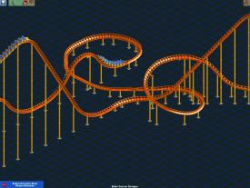
Guys i need advice and opinions on this part of my layout. Personally i think that the corner is too stretched out, it hast to be in order to directly pass under the bunny hop though. Should i change the segment or is it acceptable?
-

 JDP
Offline
people need to start making their designs make sense. you have tight helix with the middle track bend selection leading out(around the drops first hill) and and then you break up the large turn pieces. it dont make sense. if you have to force it then restart... well that's what i do
-JDP -

 Luigi
Offline
It looks good, but I have the feeling it is missing something. I can't really say what it is, but it just hasn't got the 'WOW' factor at the moment. Also, I'm not a big fan of the diagonal supports sticking out.
 -

 Flap
Offline
A lot of good stuff passed by,
What do you think about the layouts: No Recreation of Battle star, but also a Vekoma Dualing Coaster:
-

 Flap
Offline
Looks neat, Flap. Have fun working on those supports.

The supports is not a problem on this one,
it's getting quite a lot of supports and i try to get it themed as well, getting a hard job, but thats not a problem.
Also the Inverted one is verry intense,
So i started wondering how you all think,
They have launched lifthills both,
I was wondering if anyone prefer the 4D catwalks or the Wooden Coaster ones on the Inverteds... -

 Flap
Offline
I only missing Footers,
Maybey you could give the ride footers,
Nothing wrong with the rest of it. -

 StormRunnerFan
Offline
I feel like there should be a fence of some kind around it. But I absolutely love the supports, except for the lack of footers
 -

inVersed Offline
I really don't like those random purple and white flowers... they do not look natural -
 Luketh
Offline
Gotta agree with inVersed here. It's not so much the flowers themselves I don't like, but the amount of flowers. Make them the same color blue as the rails of the woodie are and take out about half of them and see how you like it.
The coaster itself looks freakin' awesome, though. -

 Fizzix
Offline
Try easing the sand into the grass with grass/dirt or something else, it makes the screen look a little weird.
 -

 Goliath123
Offline
Thanks guys, ill look into the flowers and the sand texture, but i think ill skip the footers for this one - Its quite a big coaster.
Oh and nin, which design?
 Tags
Tags
- No Tags
