(Archive) Advertising District / Dump-Place
-
 19-April 07
-

 GigaG
Offline
Fantastico, the TT expansion has plenty of futuristic stuff. I know it's odd, but the scenery in TT is better than most make it out to be.
 -

 Timothy Cross
Offline
Giga- No thanks. I enjoy creating my own technological inventions in RCT, not what Atari has to offer.
Louis!- Glad to hear it, bud. Thanks. -

 Insanity
Offline
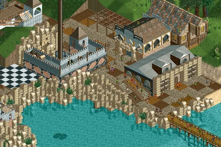
WOW. I'm Liking everything, from the transfer devices, to the station roof, and the supports. Great job!
 -

 posix
Offline
technically clean and impressive, but too hacked for my liking. have you never been tempted to just build the traditional ll style louis?
 -

 Cena
Offline
Too much white. Care to show a screen with normal woodie colors? I am curious to see how that looks.
For the rest I agree with Posix about clean and impressive, and with inVersed about the impressive detailing. -

 musicman
Offline
Have you tried it with different colors on the catwalks (perhaps black or red)? Looks nice, but somewhat plain at the moment; I trust that will change as more detail is added.
How's your "other" (or perhaps "other other") project going?
-

inVersed Offline
Too much white. Care to show a screen with normal woodie colors? I am curious to see how that looks.
I think he is going for a classic woodie and typically all white is the "normal" woodie color for a classic. -

 nin
Offline
Posix, I really do feel like you're too hesitant with moving on. I understand the nostalgia thing, but in a world where everyone's watching movies in color, you'd be that one guy who's watching them in 3D. It was fun when it was here, but sometimes you have to move on. I know I'm beating a dead horse here, but I never see you enjoy anything anymore.
Louis, I really do love the roof on that. Not the dull brown border, as i feel like it should match the 'brighter' brown used at the base, but perhaps you didn't match them as the roof and base would blend? Otherwise it's looking fantastic, I'm a sucker for an all-white coaster. My only real complaint is that it's not finished. -

 pierrot
Offline
simply impressive louis, glad to see you started a new LL project!
btw, I remember you hate to overuse codex? -

 Louis!
Offline
WOW. I'm Liking everything, from the transfer devices, to the station roof, and the supports. Great job!
Thanksclassy
Cheerstechnically clean and impressive, but too hacked for my liking. have you never been tempted to just build the traditional ll style louis?
I used to build in that style, then developed into what I would call my own style. I've always tried to get back into a more traditional route to experiment a bit, but I enjoy the way I play atm. I think that I have a nice balance of traditionalism and modernism. I also think that Viper was quite traditional.i LOVE that screen Louis. Very impresssive detailing.
ThankyouToo much white. Care to show a screen with normal woodie colors? I am curious to see how that looks.
For the rest I agree with Posix about clean and impressive, and with inVersed about the impressive detailing.
It looks shit lol plus it's meant to be a traditional all white coaster, hence the all white Thanks though
Have you tried it with different colors on the catwalks (perhaps black or red)? Looks nice, but somewhat plain at the moment; I trust that will change as more detail is added.

How's your "other" (or perhaps "other other") project going?
Its kinda not coming along lol cause I need to get properly back into things first, i've had this screen built for a while you see lol its not majorly new.Louis, I really do love the roof on that. Not the dull brown border, as i feel like it should match the 'brighter' brown used at the base, but perhaps you didn't match them as the roof and base would blend? Otherwise it's looking fantastic, I'm a sucker for an all-white coaster. My only real complaint is that it's not finished.
Yeah I did it to distinguish the two haha
simply impressive louis, glad to see you started a new LL project!
btw, I remember you hate to overuse codex?
I do, which is why I haven;t overused it I don't like parks that use codex for the sake of using codex, or parks that just look un-naturally built.
-

 posix
Offline
nin, i don't really consider technicalities or details an improvement. i like to look for strong concept, atmosphere, flow and cleverness of design. the mechanicalistic style that so many people try to run after these days destroys most of these aspects for me. i find it nerdy, senseless and unartistic. as sentimental as it may sound, but i find "there is no soul to it". having said that, it's definitely true that i unobjectively idealise traditional style, but that's just because i liked it so much back then. when that happens i don't think you can really escape idealisation.
so yeah, it's a bit depressing, because it's true that i don't get truly excited over anything these days. unless liampie might decide to go further with the style he showed in that rapids design and the screens of his "state of the art" projects.
 Tags
Tags
- No Tags


