(Archive) Advertising District / Dump-Place
-
 19-April 07
-

 Hex
Offline
Thanks. Any in mind? I think you figured it out but this was inspired by your "Hyperion" creation.
-

 Metropole
Offline
SuicideCarz, work on that pit with the loop. Make it a bit more interesting, and more a feature.
 -

 mardy
Offline
Not bad!
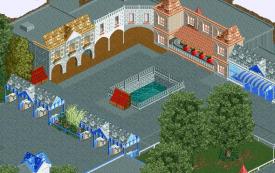
I don't like the building left to the blue one, you still see the top of a entrance. And where are the map's at the fountain for? -

 chorkiel
Offline
^My guess would be, that they are to show people where they are..
And I like that pink-ish building, except for the glitch. It fits the ride really well. -
tdub96 Offline
@Mav...wow....thats my home park too. I was just going based on colors i guess. My bad.
Still, its the turtles that are located near the Phantom, not a troika ride...but I guess its not a recreation based on color so carry on bud -

 Flap
Offline
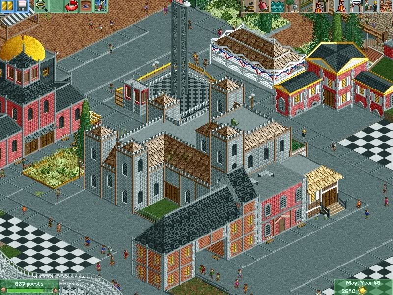
Xcars i really enjoyed watching your Picture!
But the Entrance is an issue of the ride.
SuicideCarz, it has something, but it's kinda Blocky and easy i think.
It's not my favorite architecture style.
@Maverix looks really great the Polyp! -

 mardy
Offline
^My guess would be, that they are to show people where they are..
Do you think i didn't know that? You understand me wrong. I think the are mis-placed. Why put a map rack by a fountain? -

 wildroller
Offline
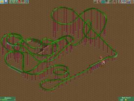
Hello, starting working on a flying coaster and would love some feedback on the layout, the layout features a large vertical loop inspired by the newest B&M flyer that has a small loop
 . The coaster is going to be heavily themed in a canyon with multiple tunnels as well!
Anyway, feedback on the naked layout would be awesome! The goal is to have a some what realistic layout in a fantasy setting!
-

 Hex
Offline
Nice screen, Jag! I think you should add more detail into the gray wall and I don't like how the path just switches like that. Otherwise it's not bad IMO. Keep up the good work!
 Tags
Tags
- No Tags


