(Archive) Advertising District / Dump-Place
-
 19-April 07
-

 JDP
Offline
everything looks good but the coaster.
the layout doesnt make sense and it contradicts itself. the track after the loop should be slanted a tile or two earlier to make that turn flow better. you have extra track after to make it look good, but completely left out the hill going into it. the predrop leading into the up hill turn is strange too... it's like the predrop doesnt serve its actual purpose.
also, the track after the wingover is lazy dude. i dont know why you of all people would force that stretched banked turn when there's plenty more possibles.
it still looks nice overall and you are good with pacing so im hoping that's not an issue.
-JDP -

 Liampie
Offline
Now if only you'd finish Southport...
Southport will be taken care of!
RRP, no trees or buildings? -

 prodigy
Offline
@ RRP: You should overwork nearly 90% of the connecting parts between supports and track. The rest is really wonderfull!
 -

 BelgianGuy
Offline
While it's good RRP I don't think it works as well as others seem to say, for once I agree with JDP and think the layout is weird, the way you envisioned the turn from the high cork to the interlock might work in RL but here it looks weird and lacks aesthetic flow for me tbh, also the way the queue has no real path is weird unless you still need to do that part...
 -

 robbie92
Offline
RRP, the colors for that are fantastic. The combination of the purple track and teal supports is rare on this site, and is utterly gorgeous. I also find the interaction between the ride and the queue great. Finally, that station is pure joy for me.
Oh, and I love that little detail of the mesh underneath that waterfall to help keep the path drained and "clear." Do you have a bench for this? -

 RRP
Offline
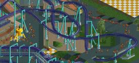
The banking into the turn under the lift is already corrected.Im not sure what your concern is with the turn after the wing over.BG mentions something similar. Im assuming both of you are under the impression that it was just a long lazy banked left turn into the interlocking wingovers but its actually like thiseverything looks good but the coaster.the layout doesnt make sense and it contradicts itself. the track after the loop should be slanted a tile or two earlier to make that turn flow better. you have extra track after to make it look good, but completely left out the hill going into it. the predrop leading into the up hill turn is strange too... it's like the predrop doesnt serve its actual purpose. also, the track after the wingover is lazy dude. i dont know why you of all people would force that stretched banked turn when there's plenty more possibles. it still looks nice overall and you are good with pacing so im hoping that's not an issue.-JDP
-

 Luigi
Offline
Wow massive improvement rct2isboss. My only complaint is that the brake is too long. Maybe add another bunnyhop before it hits the brakes.
 -

 Hex
Offline
Rct2isboss man that's a major improvement. I agree with Luigi about the long brake, add another bunnyhop. Also the Boomerang in the back, it doesn't look right, maybe it's just my eyes?
 -

 musicman
Offline
rct2isboss; if you're going for a standard boomerang layout, the loop needs to be on the other side of the cobra roll (opposite the station) so the spikes line up.
Anyone recognize this? -

 F0ndue
Offline
Disneylandian,aside my affection for coasters I also like trains(yes I know asdf),thats in our family,so please could you share this?
 Tags
Tags
- No Tags

