(Archive) Advertising District / Dump-Place
-
 19-April 07
-

 nin
Offline
Nice screen and tutorial Coupon
It does need more, though, as it looks just like everything you've ever made. Progress with your parkmaking. -

 Metropole
Offline
Hm, some screens to comment on here.
zburns: Wow. That is fantastic work. An excellent take on a batman theme, and not one that is the obvious choice. Looking forward to this one very much.
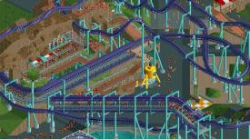
Boss: That is the best work I've seen from you. Your coaster seems to serve purpose, which is nice. With the landscaping bit, work out what it is you want it to achieve, come up with a general shape for it rather than random jagged rocks so it has more flow, whilst stil being interesting.
GigaG: Looks ok, the theming will make or break it.
SuicideCars: Not a fan. There doesn't seem to be any direction other than having a large warehousy building with seemingly unrelated facades. Think of a purpose for you work.
Coupon: Very impressive flat, agree with JDP on the queue cover. To overbearing. Also, lacks any life and atmosphere, something that seems to be your main problem. -

 Luigi
Offline
The flatride is awesome. The queue covering should be lowered a few units and give it some other colors. I agree though with metro that is is a bit lifeless. Even the guests seem to have no life anymore
-

 chorkiel
Offline
^I was about to say all of that XD
coupon, maybe you can add some more peeps. it'll give it more life, some queue peeps and maybe some onride peeps. -

 Phatage
Offline
That train is really cool, but as Cena said, shame about the scale... unless it's meant to be theming only and not a real train. Or unless you create a whole park/area to that scale and not let peeps in, but it would be hard to include any real rides.
On a related note, Foozy made really big peeps a while back to satirize that infamous 'hyper-detailed' park, too bad the image doesn't work any more though: http://www.nedesigns...h-1#entry168263 -

 Midnight Aurora
Offline
There's a lot of great things in that pic, RRP, but I think my favourite is the bright purple highlight on the spine of the lift.
 Tags
Tags
- No Tags

