(Archive) Advertising District / Dump-Place
-
 19-April 07
-

FullMetal Offline
^^ That's not a catwalk, it's an awning. And it's gorgeous! Can't wait to see that on the front page!
-

 zburns999
Offline
^It's honestly pretty surreal to have one of the best players in the game say that to me lol
 -

inVersed Offline
Zburns that has to be the most unique batman theme I have ever seen. Very well executed too. Six Flags should take notes. -

 Liampie
Offline
I love that, zburns. Well designed!
Did you put path on every tile in the last screen? Because they're walking in a straight line and it looks bad. -

 Comet
Offline
Take your own advice and put some quarter tile foliage in there
Maybe try making the bridge a little more interesting as well
Other than that it looks good -

 Hex
Offline
I'm not sure why, but I'm not feeling the layout there Giga.
I'm hoping this is better than my last attempt at the building? If not I'll try until I get it to everybody's liking.

-

 JDP
Offline
out of the last three screens who would of thought rct2isboss would have the best one.
you can only get better dude. i actually thought you were the next gigag, but congratulations your not.
-JDP -

 chorkiel
Offline
Suicide, I love your concept!
I dislike the clash of styles; medieval, modern, futuristic and they are so close to each other.
You can try and give each side of that building it's own building style with a transition on the corners
but it's impossible to do that on one side.
Other than that, what pierrot said, it's too gray!
Try something with the roof, more colors or go for a really realistic roof and look for roofs on google (maps) + bing maps -

 GigaG
Offline
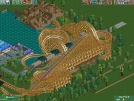
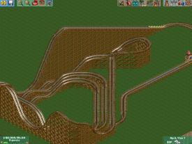
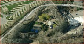
The coaster is inspired by Mean Streak and it's sibling (or at least it was until it was redone), Texas Giant. Both are/were wooden coasters with mostly 1-way turns, like this picture of Mean Streak. I understand its turns change direction after the turn, but I'm sure my idea of a coaster could beat the Mean Streak any day.
 Tags
Tags
- No Tags


