(Archive) Advertising District / Dump-Place
-
 19-April 07
-

 Luigi
Offline
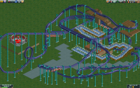
Xcars: Supports and track with the same color just doesn't work imo. I'm also not really a fan of all the different path textures.
RRP: I really like the start of this of this ride. After the helix at the top right I dont't really like it anymore. It doesn't look very flowing after this helix.
rct2isboss: Focus on the bridge. Coaster lay-out seems to be one of your best so far though!
FullMetal: I like the lay-out as it is. Don't touch a thing
-

 musicman
Offline

Uploaded with ImageShack.us
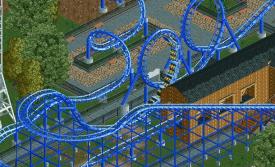
Red roof or black roof? Sorry for the thumbnail. (I hate computers. (so why am I on one? ))
))
-

 musicman
Offline
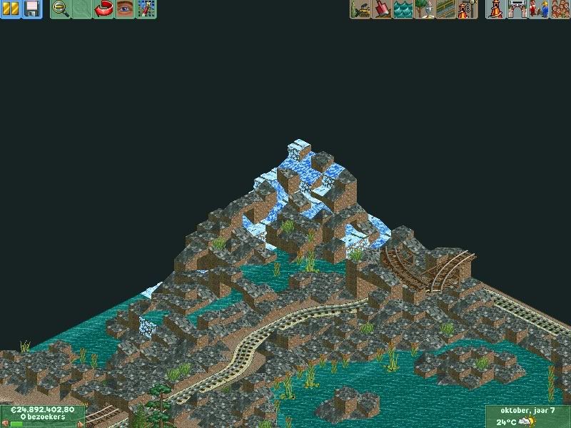
Completely made out of 1/4 land blocks.

Not necessarily a good thing; looks interesting though. -

 JDP
Offline
not sure about the large wingover rrp, it really throws the design off. i see the nemesis inferno inspiration but the design itself dont make sense
-JDP -

 chorkiel
Offline
I saw that picture before I saw the author, I thougt it was jag..
Mardy, the screen looks pretty good imo though I dislike that train-road being on the edge of the map, (rule #1)
 Tags
Tags
- No Tags
