(Archive) Advertising District / Dump-Place
-
 19-April 07
-

 musicman
Offline
Your restaurant will flood.
this, but I'm glad to see you making better use of colors.
-

 Timothy Cross
Offline

Sparkh, this was the best screen on page 572. Let no one tell you otherwise. Symmetry is fine; if it's your style,, and direction.
This is your style and direction.. just go deeper and deeper into it,. -

 musicman
Offline
This is your style and direction.. just go deeper and deeper into it,.
Unless, of course, you want to do something different. -

 robbie92
Offline
Things going slowly here, so I figured I'll add another screen. This is the start of my billionth FFA idea, a Worlds Fair set in between 1890-1900. Again, it's very unfinished, but I wanna show my opponents and the community that the Game is On.
-

 posix
Offline
it's a bit ironic to see the detail level and then read you saying "it's going slowly".
 -

 Fr3ak
Offline
The part in the middle is pretty much perfect but I don't like the wings.
I do have the feeling that they don't fit the middle part. -

 robbie92
Offline
FUCK. YOU.
Sorry...
Been wanting to do this for a while, so I figured now was a good time. I had no idea you were doing the same thing.
That aside, prepare for your ass to be kicked...
-

 Phatage
Offline
Whereas I thought that a good amount of the past structures I've seen from you have relied on ornament for complexity's sake, I really see your architecture progressing into a level where you're really envisioning something spectacular and doing a great job in RCT replicating your vision; essentially I think the complexity is going to better use. There's obviously a good deal of custom scenery in this screen, not a bad thing, but there's still a bit of improvisation especially with the statues and thus the building front really exhibits why I think RCT2 in particular is so great. It does appear though that the slanted wood pieces on the left bank of glass roof are not entirely aligned.
 -

FullMetal Offline
robbie, that's by far the coolest thing I've ever seen from you. And it isn't even done yet!
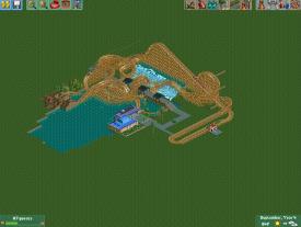
Trying to nail down a layout for an invert. I like it up until the MCBR, but after that....meh. Thoughts? -

 Comet
Offline
Looks good I would just make the slope into the zero-g a little more gradual, same goes for the drop out of the MCBR
And to be honest I like the part after the MCBR more than the part before it
 Tags
Tags
- No Tags


