(Archive) Advertising District / Dump-Place
-
 19-April 07
-

 Cocoa
Offline
dirt: great layout! superb, although i woner how you're gonna pull of the station around the bit where it curves out
freaky: good work, but it seems like you're relying on those rooves too much for your theme and detailing. show me you can keep up that theme without getting repetetive, and then i'll really congratulate you -

 JDP
Offline
dirt your layout should have more interaction. each element seems to be alone and the amount of straight track next to the station is uninspired. give it another go and try to make the layout blend more.
either way im happy to see you're still playing
-JDP -

 That Guy
Offline
THOSE ARE THE SUPPORTS I'M LOOKING FOR.
They're in Huntington Theme Park (Might've messed up on the name there...) from Goliath. -

 Dotrobot
Offline
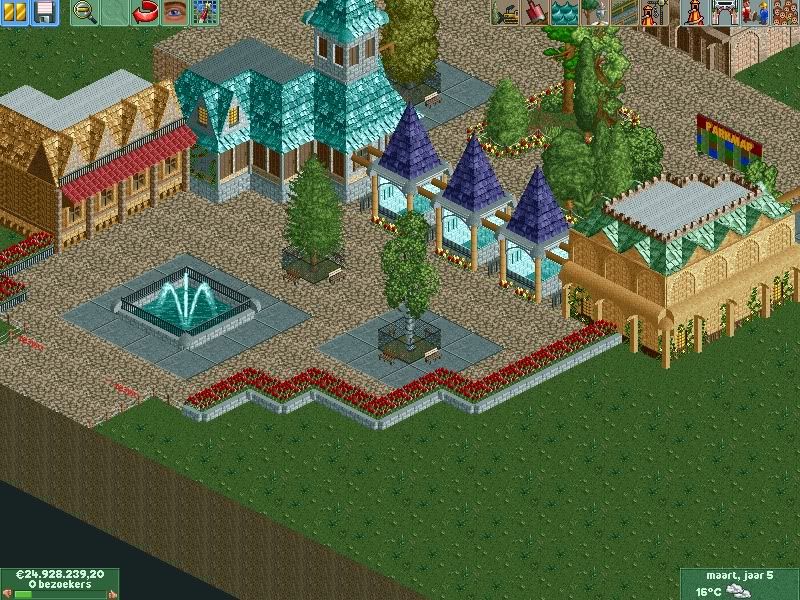
Get rid of those planters. The pre-entrance one. Keep the entrance area nice and clear and I believe there are too many roof colors. I suggest narrowing it down to just 2.
I also suggest getting rid of one post entrance planter. The one closer to the entrance. It feels very cramped for an entrance with all those trees on the paths -

 StormRunnerFan
Offline
Anyone who can guess what this is gets a cookie! Hint: It's Disney. And the ride itself has a different set up than it does at Disneyland... and Tokyo Disneyland.
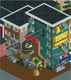
-Storm -

 nin
Offline
I feel like the roof distracts from it all. This seems like it's trying to be Highball's Disney as well as trying to break and be it's own. Let it break away.
 -

 Cocoa
Offline
holy crap that is soo awesome!! omg your disney project just jumped up so many spots in my projects to watch list!
its not that detailed or perfect, but the atmosphere it reeks is very awesome. great work!
@mardy: in general, the archy is just OK. the actual layout seems a bit weird though, with those random trees and awkward path setup. and what were you planning on putting behind those flowers? thats gonna be hard to fill... -

 mardy
Offline
@stormrunnerfan: that is very, very good!
@Dotrobot: Heard
@cocoa: thanks. Behind the flowers, i want to place a empty area, with a few trees. -

 Liampie
Online
It has been too long since you posted! The screen is fantastic again, except for the roof. That object kills it.
 -

 Flap
Offline


Got some problems with the lift, So i posted a Topic in the Ask the Expert place.
Really getting Far now. -

 Luigi
Offline
Supports of the vertical drop are really weird and I agree with BG about the foliage. Seems like a nice little project otherwise.
 -

 Flap
Offline
Supports of the vertical drop are really weird and I agree with BG about the foliage. Seems like a nice little project otherwise.
I Agree that one, but i don't know why i always use that option.
Think it's the best fit to not creating a Support mess.
This project was pure for upgrading my detail skills.
And i Still don't get the Foliage part what the !@$@# Does Foliage Means?
 Tags
Tags
- No Tags
