(Archive) Advertising District / Dump-Place
-
 19-April 07
-

 robbie92
Offline
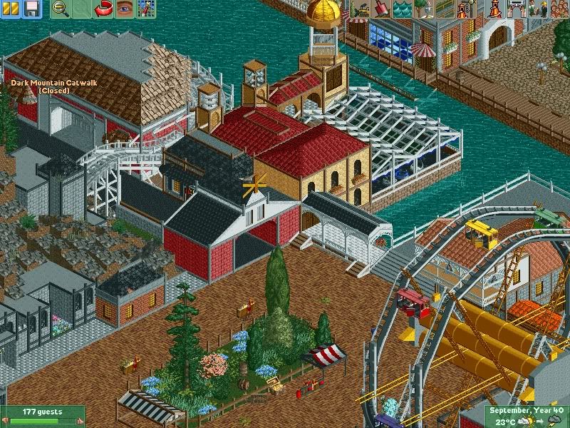
That gives off the kind of retro hodge-podge that a lot of old parks used to have. Great work!
 -

 chorkiel
Offline
I love the trams on that ferris wheel !
This is all so creative and not very much done lately. -

Wicksteed Offline
I suppose redoing the trams so the doors are closed would be too much work? Cause it looks rather dangerous right now. Other than that it's a really nice screen. -

 Chocotopian
Offline
Nice! Cool detailing with the treasure chest used as the crate of goods at the stall (don't know if it's been used in this way before, but I like it here anyway). Was just curious about the brick paths though: what made you decide to alternate their direction? I can't say I like nor dislike the choice, just wondering what inspired you to do so.
 -

 Phatage
Offline
There have been too many good screens at NE lately. This one demonstrates how the best hacking happens when it isn't noticeable, that the result is something that you wouldn't be able to initially recognize as hacking. Along that note, I would agree with that the best ncso is when you wouldn't be able to initially recognize as lacking custom scenery, and that's what happened with me when I first saw this screen. I'm curious as to if this is supposed to be a water coaster or more traditional water ride too.
The only iffy thing is the ivy on the wall. I definitely appreciate the idea but it's a bit awkward with how rectangular it has to be without custom scenery and the fact that the rest of the building doesn't have any ivy, think there's a solution to making it look more natural? Btw seems like you're missing one or two fences along the queue.
 Tags
Tags
- No Tags


