(Archive) Advertising District / Dump-Place
-
 19-April 07
-
tdub96 Offline
Yea, that crater idea I first saw from Freak. Its actually in the dump here somewhere, a few pages back i think.
Comet, I like it a lot dude. Reminds me of some classic rct with a modern touch. Looks a bit colonial too, good stuff.
Xcars, I think the supports are just fine the way they are. However I'm not all that familiar with Beemer flyer supporting. So maybe check up on some stuff at RCDB.
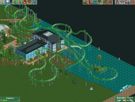
Freaky, thats not too bad dude. Hoping the pacing is still good throughout the whole ride, but im not liking the station that much. -

 Cocoa
Offline
hey jag, that's the first decent thing I've seen from you. nice work.
^hey you posted that while I typed! great screen though! -

 Fisch
Offline
Yeah.. You might wanna check-up on your daughters' real dad..
I know commenting on this has nothing to do with the pictures shown in this topic but I thought I'd just pick this discussion between Chorkiel and K0NG back up.
 Chorkiel, are there no sex ed classes in the Netherlands or is this just a translation problem?
edit:
^ by the way Cocoa, how did he post that while you typed? He posted 23 minutes before you! Better type a bit faster from now on.
  jk
jk
-

 Jaguar
Offline
hey jag, that's the first decent thing I've seen from you. nice work.
I thought the castle and the buildings in Chicago forest park were a few months ago, anyways thanks.
Also, Austin, I like the architecture. -

 That Guy
Offline
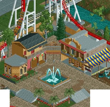
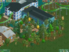
Austin, I like the balcony, but the sitting area seems a little forced... this is probably one of your better screens though, I like it.
 -

 Austin55
Offline
Haha, Damn Cocoa you type slow! thanks.
Fizziz-how on earth do you remember that screen? I had forgotten about that. But no this is something new.
That guy-Thanks. I guess the seating area was meant to be secluded when the building were originally built, but then the coaster came later. It would make more sense If you knew the type of park, but Im not ready to reveal that yet. -

 mardy
Offline
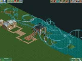
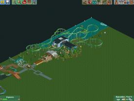
ok.... i dont get the name. the coaster is blue....
anyway, he isn't bad. but the station is very ugly. Brrrr... -

 chorkiel
Offline
I wouldn't call that coaster bad.
It just lacks some planning like with the s-bends.
You could've made that first s-bend banked if you weren't building so close to the edge of the map. -

RMM Offline
i thought rule #1 was to not use grass underneath pathing. i know it's in the top 3. fucking rct rule books.
and as shitty as your work is rct2isboss, i respect you simply because your screen included a rollercoaster. your layouts have potential as well.
 Tags
Tags
- No Tags
