(Archive) Advertising District / Dump-Place
-
 19-April 07
-

 Jaguar
Offline
^what's wrong with that question, excuse me if im asking for help and advice
There's a difference between asking for advice and asking someone how you should build your park. I mean, how hard is it to find a color besides brown, choose pale red for god's sake.
Also, Liampie
-

 K0NG
Offline
Fuck, Liam...that was the funniest thing I've seen here in a while. lol'd when I saw it and I'm still chuckling as I type this.
 -

 nin
Offline
how about this octopus ride?
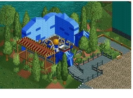
Good idea, poor execution. I'd like to see you give another go at this, as I really like the idea you had but it's just not working right now. -

 Hex
Offline
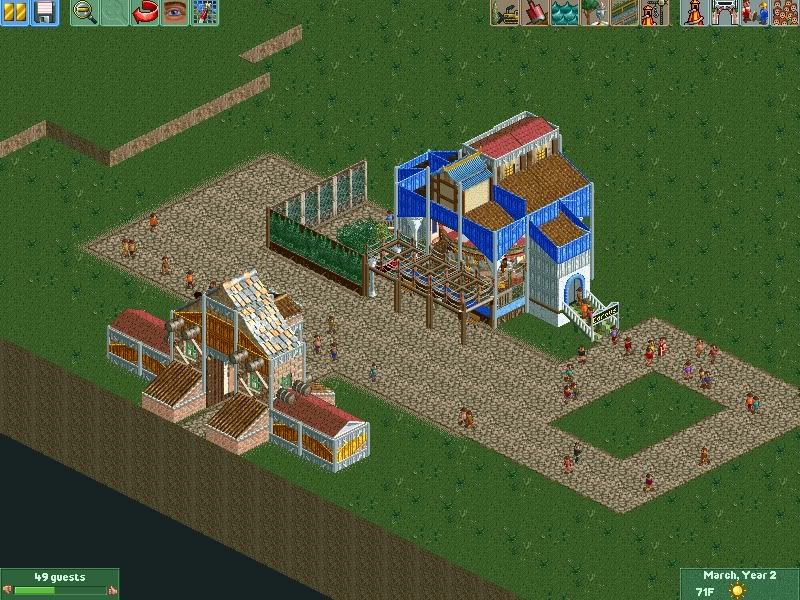
Here's a nice little shot of the GCI coaster that tdub has built and it fits in quite nicely.
-

 Jaguar
Offline
Good idea, poor execution.
Been there, Done that.
Anyways, SuicideCarz, it looks good and simplistic, the buildings seem random though. -

 mardy
Offline
Ok, i remove the tent and i lower the wall.
Suicidecarz, i really like it! But i dont think the colors fit well. -

 Luigi
Offline
Suicidecarz, thats not bad at all. I would suggest to put sand under the path and remove the poles sticking out. Just zero clearance them to the right height. I also think the station has too many different textures.
and LOL@Liam
-

 wildroller
Offline
Yes SuicideCars, got to agree you buildings don't seem to flow together. While every building should have it's own identity, it also should look like it belongs with the other buildings. Make you buildings look like brothers and sisters of each other. I do have to give you props for timing the woody and having the two trains fly by each other, I love seeing that in a coaster!
Edit - Tdub - I guess I have to give you the props for the layout .
.
-

 tdub96
Offline
^I did the coaster layout
SC, I really do like what you have going with the park so far. While i agree that some buildings dont really flow together, the architecture is still pretty darn good for NCSO's. Keep it up dude. -

 Hex
Offline
Thanks everyone! Compliments to tdub for the woodie and the station. I will zero clearance the poles right away.
-

 chorkiel
Offline
What's up with everyone doing NCSO lately ?
It's not any better than using cusom scenery.
If you want to show your creative side by using objects only given by the game you should do LL.
NCSO is like fucking a girl in the pee-hole. There are other, less disgusting, ways to do it but you choose the bad one. -

 mardy
Offline
Your park is open.. There is only 1 attraction.....
I dont think it's that bad, but ether it good. I like the colours, but that big fence doesn't Make sense. -

inVersed Offline
jag, that carousel is kick ass. Everything else isn't. I think your big problem is the lack of planning. All your work seems thrown togather without a sense of organization and lack composition and aesthetics. Some of the best parks take months to plan before the game is even turned on. -

 wildroller
Offline
I think you got way to many textures going on there Jag. I count 5 different roofs in the screen and just as many wall textures, just doesn't work. Also I agree with chorkiel, unless you are a genius like JDP NCSO is probably not going to give you good results!
 Tags
Tags
- No Tags


