(Archive) Advertising District / Dump-Place
-
 19-April 07
-

 That Guy
Offline
Define 'new'... it looks like you're just staying in your comfort zone, think outside the box.
 -

 SSSammy
Offline
i was just gonna say that, that guy.
you really need to do something different for once maverix. you have accolades with stuff like that. -

 Fizzix
Offline
Same colors, style of buildings, everything. Hey Sam, where do you get your avatars? lol
 -

 wildroller
Offline
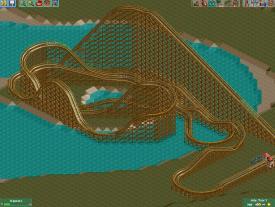
I've spent the last few days looking at pics of some real woodies and attempting to come up with a cool layout in RCT. I have come up with a pretty fun layout inspired by parts of Medusa's layout at Six Flags Mexico, would love some feedback as I start moving forward on a park that it will be a part of. Thanks!
-
 Luketh
Offline
Same colors, style of buildings, everything. Hey Sam, where do you get your avatars? lol
I'm pretty sure he gets 'em from the .gif section of reddit.
I like the layout, wildroller, except I feel like the turn after the first drop would hurt a good bit.. -

 Luigi
Offline
The lake on the island seems a bit random.
The turn after the first drop is strange indeed. This probably could only be an element for a steel coaster. -

 Liampie
Offline
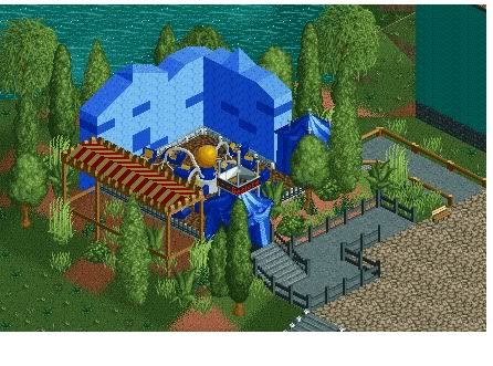
No. The ride is very small and gets lost between these large walls and that weird tent (what is that supposed to be anyway?).
 -

 mardy
Offline
thanks for the comment.
the large walls suppose to be some sort of ''ocean''. i mean, you have to feel that your under water.
the weird tent is useless. i know. its just a room filling thing -

 wildroller
Offline
The entire ride is completely hidden from guests with the wall, trees, and tent thing!
And thanks for the feedback, I am going to modify the layout to get rid of the first turn
-

 GameWorldLeader
Offline
hey guys,
working on a park with rct2isboss. we dont have that much done now but we're working on it.
so how is it so far?


-
 tdub96
Offline
Wayyy too many trees. It is possible to pull it off with that many trees, but you have to at least vary the type of tree...i see only 3.
Wildroller, maybe scale it down a bit so it isnt as massive? That would also make the g's on the first turn a little more withstandable. -

 GameWorldLeader
Offline
the coaster doesnt have a name yet, the sign says wooden roller. i see what you mean about the trees, we'll go back and fix those
 -

 wildroller
Offline
You guys need to put some color in there as well, brown and green is not enough...
 -

 Hex
Offline
It's too hidden. There are too many trees and it is dull. Listen to what tdub and wildroller said, fix it, then post some more pictures.
EDIT: Also use variation of trees and work on your foliage. Use 8cars to zero clearance and add bushes, weeds, and some flowers in there. Good luck! -

 GameWorldLeader
Offline
^what's wrong with that question, excuse me if im asking for help and advice
 Tags
Tags
- No Tags
