(Archive) Advertising District / Dump-Place
-
 19-April 07
-

 jandoa
Offline
Disneylandian: Really nice screen. I never was at Disneyland. So please finish, so I save up 50€ and can enjoy Disneyland from my sofa!
Also thanks to all of you who commented on my last screen. That gave me the motivation to build around the hall of the coaster a Freefalltower and a Haunted House.
Comments are welcome as always.
Greetings -
 highroll3r
Offline
That indoor freefall looks awsome. The path change as suggested looks so much better too. Jandoa this is coming along very nicely now keep at it!
 -

 Luigi
Offline
Great! Could use some fencing at the bottom.
I love how the attractions interact with the surroundings. -

 posix
Offline
still looks phantastic.
suggestions:
- do more foliage/terrain design. add jagged rocks and shrubs where appropriate. this might make it look more organic. it's a bit cold at the moment.
- your colours and shapes tend to become a bit too standardised for me in the screen. while the systematic approach you take to your architecture is good, i think you could add a few more colours to increase the depth of the overall impression.
- if that's the entrance to "mystery tower", i would consider to change it, because right now it looks too much like the entrance to something small and insignificant like a little shop maybe. bigger rides like these usually have their own dedicated space for an entrance gate that is being given a bit more prominent spot. you could do this by adding a side-niche (ausbuchtung) to your main path that leads towards the entrance of the ride. this will create the effect that people are moving towards the ride. ride now, they "pass it by" because it's just aside the main path. -

 Hex
Offline
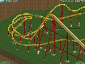
Working on layouts and I liked this one. It's a twister roller coaster called "Orion's Belt" Tell me what you think.
Sorry, the picture wouldn't upload, got it to work now. -

tdub96 Offline
B&M usually does inversions in a "rapid-fire" sequence. Plus, your Immelman looks weird as hell. Use the Barrell rolls to complete it better. Its not that bad, but needs work. -

 Hex
Offline
OK, I took out the corkscrew in the Immelman, and made the inversions happen more quickly like you said, and I took out the turn in the beginning, what do you think?
Uploaded with ImageShack.us -

tdub96 Offline
There you go dude. Very nice, thats exactly like something B&M would build. Great job of taking advice too, btw.
If you need any other help, feel free to let me know. I need an excuse to play again, maybe I could help with a project. -

 JDP
Offline
dont be afraid to stretch out your turns and use better turning transitions. also that heartline should be going the other way
-JDP
 Tags
Tags
- No Tags


