(Archive) Advertising District / Dump-Place
-
 19-April 07
-

 Liampie
Offline
Hey Liam can you show them from different views?

Thanks all. I didn't make the 2x2 object yet, instead I watched Slumdog Millionair. Great movie! -

 Tolsimir
Offline
how far is it from the edge of the tile? would be useful for dense vines etc aswell
-

 nin
Offline
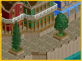
Pretty drab; needs more color. I'm thinking it's that huge brown wall ruining it a bit.
Otherwise, the form of everything is great. -

 wildroller
Offline
I think you need a different path texture from the ground and the edge of the buildings.
 -

 Luigi
Offline
The brown walls ruin the screen. Change it to tan or grey instead. I really like it other than that
-

 chorkiel
Offline
It's not just the color of the walls. It's the color of the walls combined with the path which make it look so monotone.
 -

 Dotrobot
Offline
I think it'd be better if the type of path was changed instead to black or grey tarmac.
 -

 musicman
Offline
Let's see, we got Batman from SFGAM (and others, but work with me
 ), Iron Wolf from SFGAM, and Raging Bull from SFGAM: I'm assuming you're doing a Holiday World recreation?
-

 rK_
Offline
I dont see any inspiration, i see random architecture and too much unnatural foliage. Your entrance into the park just looks so cramped and and again unnatural. Your obviously going for a feel of realism but i think you missing out on the basics, its not a bad start but it needs more separation and the colors, please work them out, serious texture clashes appear with the colors you have going on.
 -

 Cole
Offline
I agree with the clashing colors, I was hesitant about the pink/purple of the blue building on the left.
What foliage do you recommend I change/remove? do you have any suggestions for colors? -

 Austin55
Offline
Interact the path and seating area more. And possibly put something interacting with the water, dock, pathway, etc.
 -

 Luigi
Offline
I agree with what has been said above and add some lights instead of only bins and benches.
 -

 jandoa
Offline
Hey guys,
first of all thanks for your comments at my last screen.
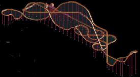
I hadn't that much time the last days, but i started to build a new attraction at my park. It's called "Mystery Chase".
Hope you like it.
Greetings
 Tags
Tags
- No Tags


