(Archive) Advertising District / Dump-Place
-
 19-April 07
-

 Dotrobot
Offline
^That and the pink cars. Unless they're park-owned cars and they're supposed to be pink.
 -

 Liampie
Online
Just made a new object... not 100% of course, but I'm pleasantly surprised at how it looks already. So much better than my other tree object.
I love it. It even looks great in autumnal colours! -

 Liampie
Online
now i finally get to decommission the big oak trees?
Yes please.
If anyone is interested, I can make a 2x2 object of this the same size as an oak tree so you can replace them easily! I can release them right away. -

 Liampie
Online
how big is it atm?
1x1 trunk, half tile leaves. It takes at least six objects to make a complete tree.
2x2 tree coming up... You'll see it online soon. -

 wildroller
Offline
Those trees looks great Liampie!
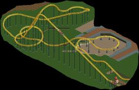
I started on a new design that I'm pretty sure I'll be able to finish, work is going pretty fast the last couple days. The layout is mostly complete although minor tweaks are likely to occur which is why most of it is not supported yet. Any feedback on the layout would be great.
Coaster's Name is Solar Flare.

-

 geewhzz
Offline
1 3 and 5 going left to right up to down look like the leaves hang down too low. but other than that, very good
 -

 Liampie
Online
You're right geewhzz, I will fix that before releasing the objects. Even though you can put the leafs as high as you want anyway.
 -

 rct2isboss
Offline
@wildroller
looks okay but it doesnt seem that u have much to work on a design with
@Liampie
trees look hot!!! -

 BelgianGuy
Offline
@wildroller, the layout is good in a sense of elements and general feel but I think you need to change direction at least once more since after the first turn they all turn in the same direction, try to avoid this...
 -

 wildroller
Offline
Damn you're right, I didn't even realize that
 , guess I'll change the turn by the paths a bit. Thanks BG.
 Tags
Tags
- No Tags


