(Archive) Advertising District / Dump-Place
-
 19-April 07
-

 Steve
Offline
nin, what the hell is that? pirates? look so good dude; you're pulling the yellow off brilliantly.
 -

 robbie92
Offline
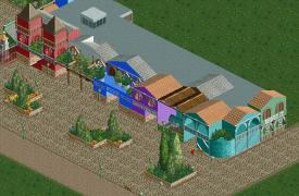
I'm curious to see how that all pulls together color-wise. I do feel like the screen is lacking some sense of harmony atm, with each individual piece colored well, but it not seeming as a single entity, which as a themed area, it should.
 -

 jusmith
Offline
nin that yellow building is badass. I love how it dominates everything else...it's almost palatial. Is it the entrance building?
 -

 Metropole
Offline
MCI, it's pretty good, though I don't like how each building has only 1 colour. Adding some details and windows and stuff with other colours that compliment the base colour will work a treat here.
 -

 Cocoa
Offline
@nin: its really good, but I didn't know it was pirates until I saw the little sign on the yellow building.
 -

 Luigi
Offline
@ MCI: I agree with metro about the colors. I'm also not a fan of all the bushes on the balcony's.
 -

RMM Offline
yea, it's pretty nice. i just can't get over how ugly the turns into and out of the station are though. -
 Maverix
Offline
The only thing I don't like is the second zero g seems way to forced, I'd rework it to include a wing over also.
 -

 robbie92
Offline
Wow, that's great! I love the placement of the seating area and the quick-service restaurant. Foliage is incredible too. Where did you come from?
Oh, and other new members, take note: THIS is how you introduce yourself to NE. -
 Luketh
Offline
I'm lovin' it, Jandoa. That seating area's looking ace and I really like how you used that brick texture that I don't see around too often. The foliage looks pretty good, but I'd suggest thickening it up on the right block in the center planter-thing... The one in the middle of the queue/eating area/ride. It looks too bare compared with the rest of the foliage.
I'm also really diggin' the queue fence. Keep it up, man!
-

 Luigi
Offline
@ Pacif: Seems like a nice layout. Curious to see how you are going to theme it.
@ jandoa: I just love the seating area and the surrounding foliage. -

 Roomie
Offline
jandoa love the screen. Only have one minor quibble. If it's "Drinks" should it not be "Burgers" plural? instead of just "Burger"
 Tags
Tags
- No Tags


