(Archive) Advertising District / Dump-Place
-
 19-April 07
-

 BelgianGuy
Offline
I like it but I don't like the fact that this'll look like frankenstein the ride with possibly a lot of different track types...
 -

 K0NG
Offline
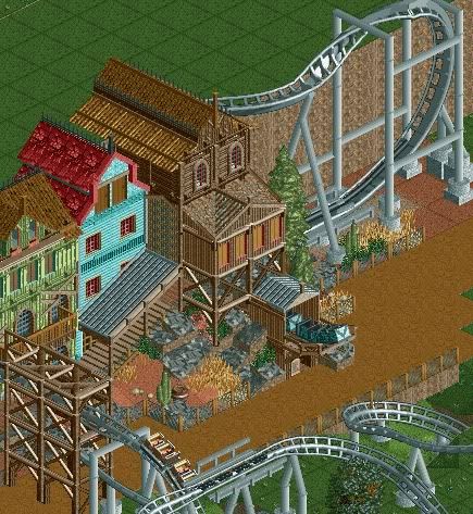
It all looks great, but I particularly like that green building with the 'boarded up' look. Nice work man.
 -

 rK_
Offline
that is greatness dimi, the buildings are almost surreal, they could easily be brought into a real life design. Loving the mine train popping out the broken shaft, thats is too nice!
 -

 jandoa
Offline
Hi nedesigns!
finally managed to post here. i hope you like my work.

Still pretty unfinished, but its the dump-place, so that shouldn't matter much (hope so).
Greetings,
jandoa -

 Metropole
Offline
I very much like that building in the first screen jandoa. I'm not a fan of the way you've done the cobra roll though.
 -

 Cocoa
Offline
the first screen is excellent (although a bit empty around the edges) but the second is a bit bare and the car ride is ugly.
 -

 jandoa
Offline
@Sammy, SuicideCarz: Thanks a lot!
@Metropole: Thanks. How can I do the CobraRoll better? Its the first Time i'm handling with custom supports and it was really hard.
@Cocoa: Thank you also. As I said, its pretty unfinished. I cover up the edges later.
Greetings -
 highroll3r
Offline
Dimi that is some awsome work there. Flawless.
Welcome to NE. To make the cobra better simply add one segment of track inbetween the two cockshrews aka corkscrews.
I think your off to an interesting start here. Firstly i think that your landscaping seems good, ive been seing alot of flat work lately but your has alot of elevation change. Your foilage, from what is there, seems fine too... Theres nothing wrong with the architecture in the first screen, its just that horrible station that bothers me. Its pretty ugly to be honest, I think its the size... I must say, in the second screen I love the little tunnel for the miniacture railway to pass under the car ride. It fabulous! The car ride itself isnt ugly at all. With more foilage and a theme itll look less bare.
 Tags
Tags
- No Tags


