(Archive) Advertising District / Dump-Place
-
 19-April 07
-

 Roomie
Offline
Technically this is possible using merged coasters then you can have as many colours as you want. But it also works with this so you can have more than 3 colours on one corkscrewColoured sections of a half corkscrew.sweetCan you see if you can do more custom colour schemes than 3 roomie

Pretty much, Just use codex to clone over the exact same ride piece from a corkscrew\corner with another colour. Doesn't even have to be the same ride. (although having just tested it. It does have to be the same ride type)parts of the same ride replaced on top of each other?
-

 SSSammy
Offline
it'd be fucking annoying to have iPhones fly at you when you're trying to eat a burrito.
 -
 jusmith
Offline
Then again it is a free iPhone!
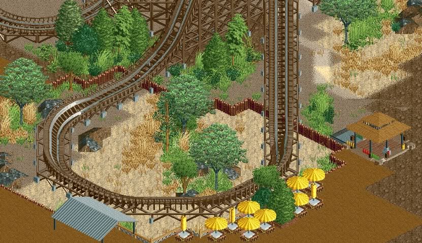
I really like the foliage BelgianGuy, but the colours/textures you have used look a bit random together. I can't tell the theme just from the screen. Hopefully you had some more elements to make what your going for more identifiable. -

 BelgianGuy
Offline
^I have, it's extremely unfinished but haven't posted a screen in a while so I figured might aswell share
 -

 Metropole
Offline
I don't like the placement of that seating area. It has the downsides of the noise of coaster, without giving people much of a view of it at all.
 -

 Luigi
Offline
Beautiful, can't wait to see a finished version of this screen! I like the seating area itself, it just deserves a better spot.
 -

 highroll3r
Offline
Great screen BG! Id say elevate the seating area slightly, for a better downward view. Or maybe a bigger fence to block those flying I phones.
 -

 Midnight Aurora
Offline
That fence in the middle bothers me. Partly because it disrupts the landscape, and partly because it doesn't accomplish a damn thing.
 -

 BelgianGuy
Offline
it's not as much a fence though MA, it's more like the supporting wood for the lowered pit the turn is in...
 -

 Midnight Aurora
Offline
...I see. Still, it really doesn't make much sense. The landscape is almost entirely the same in both the pit and the surroundings. I'd imagine if they made a pit for the turn, they'd rip all the trees out of it, too?
 -

 Austin55
Offline
BG, I really like it. A few things. The wood supporting the pit is kinda nasty, some rock work or something to make it blend in more would help. The eating area, while nice, is in a bad place. On top of flying iPhones, having a conversation would be tough. A second eating area, in a more secluded environment, would be great (SFOT has done a great job with this). Those trees, they just suck. they seem to be leaning away from the camera, they just "dont fit the graphics" of RCT at all, IMO. Also, watch out for to much brown pathing, your pushing it.
 Tags
Tags
- No Tags
