(Archive) Advertising District / Dump-Place
-
 19-April 07
-

 Louis!
Offline
Hey all,
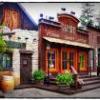
here's a test screen, just to get some feedback.
Really captured the Disney feel. This is very very very good. -

 chorkiel
Offline
coupon, you should just for the heck of it, make some buildings that are REALLY big.
Test stuff out and such. These buildings are just still really small, even though they're pretty good. -

 Casimir
Offline
Haha, everybody is doing Disney right now
dl192: Two little things - I don't really like the diagonal fence on top of the tower and I think it's odd that the same door/window structure is used twice on the right side. -
 highroll3r
Offline
Everything is cooll apart from that diagonal fence on top of the tower. Perhaps the tower could also use more detailing. For a start id have a door leading out of it to the roof balcony. Overall great archy though.
 -
 Chocotopian
Offline
The fire station reminds me very much of the recent Lego fire station set so, given my love for that, I think it’s beautiful
-

 wildroller
Offline
Feel like I should reply to the feedback on the screen I posted on up.
wildroller
Offline
Feel like I should reply to the feedback on the screen I posted on up.@ Wildroller, cool to see you are doing custom tracks, hacks and that kind of thing, I would try to balance your land out though. Having it completely out of quarter-tile-landblocks makes it look messy. I would vary a bit with ground textures as well, Now it's a lot of dirt together and a lot of rocks togehter, you might want to add some green (grass) with trees in
 . You do become better at this game, good job.
Thanks, I've been trying to learn hacks for a while, getting better at figuring everything out. As for trees, most of the land will be covered with plants and theming, certainly not going to be all brown when I'm done.Looks fun, though, I don't see why you used so many quarter tile land blocks..
wildroller, I love this screen, but utilizing quarter-tile land blocks to achieve this look is unnecessary, as you can get that exact look using the mountain tool.
It's true I could of used the mountain tool, if I had planned the project better, for some of the screen, there is a lot that I could not use the mountain tool for. Quite a bit of the land next to the water in a lot of places is only a half tile high. But I hadn't really planned it out to the fullest, this project started with realizing the river rafts can go on a diagonal (which you can see the diagonal rapid section in the screen).
Anyway thanks for the feedback, probably won't post another screen until I start up a thread about this project, by that point I'll know if I'm going for a design or a small park! -

 Louis!
Offline
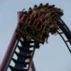
Not keen on the turnaround after the loop, or the double wingover, or the ending heartline roll. It doesn't have much flow either.
 -

 Metropole
Offline
djbrcace, that is easily the best screen I have seen from you, keep it up
Disneylandian, that is superb, nice job
Coupon, those buildings are by no means big, and they don't seem to have much identity, I have no idea what they would be used for. I like the little stall in the centre of the path though.
Chillsons, the part between the loop and the heartline looks awkward. I also don't like the heartline before the brake run, or how the tracks descends into the brake run. -

 Luigi
Offline

Recently got the RCT vibe back after a long time
What do you guys think? Still needs peeps and finishing touches. -

 chorkiel
Offline
That's some pretty good ncso I think.
For some reason it gives off a real efteling-ish vibe. -

 That Guy
Offline
That's very, very good. Love how you integrated the bumper cars, the architecture is very original, and I like the water canal.
The only problem is that the architecture, while it's original, is very repetitive, every building practically looks the same, mix it up a bit. -

 disneylandian192
Offline
It has a lovely atmosphere. I think some accents of brighter colors could really make areas pop out more, right now the canal draws my eye in to the center of the area, but the structure that I'm led to isn't very special.Perhaps consider taking another look at making this a brighter or grander structure. Just got home from an art class if you can't tell
 Tags
Tags
- No Tags
