(Archive) Advertising District / Dump-Place
-
 19-April 07
-

 Dotrobot
Offline
It's not just that. Look at the second screen's dirt. See how it has specks of green?
 -

 Brent
Offline
Clearly unfinished. But thoughts on other games to include would be helpful
Contra, Excite Bike, Paper Boy... -

 highroll3r
Offline
Any one here heard of Exhumed on Ps1? The best shooting game ever! Absolute, "i learned how to spell that from zero clearancing" amazing.
 -

 djbrcace1234
Offline
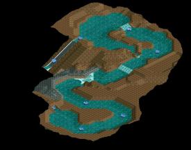
Looks fun, though, I don't see why you used so many quarter tile land blocks..
Too cliche? Still highly unfinished, though. -

 Cena
Offline
@ DJ Brace, not cliche I think, your solution with mine train track really works, for the bridge to be precise. On the normal grass, the track would fall apart under the heavy weight of the train without rocks (miniature railway) to support it. I would use normal track for the grass area, and mine-train for the bridge. Your waterfall looks weird, I mean the side of the right one ... there isn't any land to prevend the water going there. Good job though. One tip I would personally change; supports of the coaster to a bright color. Blue or Red for example.
@ Wildroller, cool to see you are doing custom tracks, hacks and that kind of thing, I would try to balance your land out though. Having it completely out of quarter-tile-landblocks makes it look messy. I would vary a bit with ground textures as well, Now it's a lot of dirt together and a lot of rocks togehter, you might want to add some green (grass) with trees in . You do become better at this game, good job.
@ Roomie, Mario looks sick. Really nice execution, no explains from my side. Just make sure the real peep-able attractions look & function good though ... -

 Cena
Offline
I like how you used my objects THAT good. Really impressed
 Scale seems a bit off, but I think thats for the fire trucks. The rest looks quite impressive to be honest
-
 disneylandian192
Offline
Thanks Cena! Perhaps a few tweaks but ultimately I think the structure's nearly done. It's turned out just how I wanted.
 -

 Luigi
Offline
@Brace even though there is nothing special, it really pleasant to look at it for some reason. The atmosphere is just great. Like Cena said you should fix the right side of the waterfall.
@Disneyland Screen looks very nice. Perhaps the red wall on the left could use a window too?
Special edit for Cpupon:
Not really big
Left building seems a bit strange from this angle. The right building is OK. Some variation in windows or adding shutters would probably be an improvement. -

 SSSammy
Offline
DLandian and coupon: really good work!
djbrcace: the bridge needs more depth, try adding more objects just to bring it out a little more.
 Tags
Tags
- No Tags


