(Archive) Advertising District / Dump-Place
-
 19-April 07
-
 jusmith
Offline
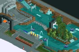
Robbie that is some of my favourite foliage that I have seen! It fits perfectly. Plus, I am a sucker for an all black colour scheme, so good choice there.
 -

 Fr3ak
Offline

Beware the Banshee's wail...
Looks totally amazing.
Would be great if the path were round too. -
 tdub96
Offline
Wow JDP, Cuban Missle Crisis theme, looks to be surely impressive.
Robbie, I dont know about the wall. I like it, then again I dont. It looks alright, but it doesnt mix very well with the stone wall you have there. Foliage is excellent though. -
 TwistedSteel77
Offline
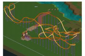
Hey guys! This is my first screen, however i've been coming to this site for years haha. Anyway, this is my one coaster entitled "Basilisk." Its still not completely done and I still have to work on my supports. I just wanted to post it and get some feedback and advice from you guys! Thanks

-

 Austin55
Offline
Holy crap thats actually really cool, the colours are beautiful and the use of the land tool is great to. Work on foliage, supports and maybe spice up your architecture somehow (perhaps adding some trim or molding to the building?) and that will be a damn good screen.
 -

 djbrcace1234
Offline
It's like Black Mamba meets an out and back Woodie--That's pretty fun!
I also agree with Austin. The basics are there, but it needs more to it to really spice it up a little bit.
Also, if you have some of those 1/4 tile land blocks, I would try and use them for your "ditch," for it can provide some new dimensions that can't be found using just RCT's land. -

 TwistedSteel77
Offline
Okay, great! Thanks!! I'm pretty sure that i have some of those so i will deffenitly check them out.
 -

 posix
Offline
TwistedSteel77, the screen is fantastic.
You have a very toughtful and successful way of designing landscape. The terrain interaction of the track, combined with the path interaction works wonderfully for me. I also love the fences you put around the track. They have two very positive effects for me: (1) they establish the coasters "place", its own little area within the park and make it more identifiable as an entity, and (2), they add the realistic style detail that the park modified the ground to fit in the coaster like this.
Another thing I find noticeable is your colour sense. Your choices are unique, which is great, and they work together somewhat harmonically, yet this could be stronger. However, I believe this is something that comes only after you've had 2-4 releases, so for now I would just attest you with an already existing talent for colour choices.
I agree it would be good for you to experiment more with foliage. Try to challenge yourself by designing overgrown cliffs, or make it looks like these little pits the coaster goes through have little weeds growing inside. Another thing I notice is your architecture, which I find good but also a bit undecided, which goes mostly for the purple building on top that I wouldn't know what it is for just from its appearance, as constrasted with the other building which clearly is a station. I suggest you give your buildings character like this to make them easily identifiable.
I'm very much looking forward to seeing more stuff from you. -

 TwistedSteel77
Offline
Thanks a ton! Yeah, one of my hardest things to do in the game is create really good buildings. The thing about this workbench, is that there is literally almost no roof peices to work with too, and i should've looked that over before i started haha. Also, for some reason my trainer isn't working properly and i can't hack the items and rides to build through so i'm still trying to work on that. But thank you guys for the feedback! I really appreciate it. PS. You can call me John if you'd like!
 -

 chorkiel
Offline
@TS77, I find that pretty awesome but that looping looks soo close to the path, wich to me looks pretty dangerous when a pretty tall person stretches his feet.
@highroll3r, I like it but it looks pretty unorganised. -

 wildroller
Offline
@highroll3r - I like the first part of it, but I don't like the trim breaks right after the MCBR. Seems like you could throw in another element or something to kill the speed instead.
 -

 BelgianGuy
Offline
I think it's the effect for a splash section that's why he's breaking it prolly to make invisible afterwards...
 -

 robbie92
Offline
If that's a splash effect, that's an incredibly shitty place for it. There'd be no room for interaction w/ anything.
 -

 Pacificoaster
Offline
The first half of the layout is alright for a floorless design, however if that second brake run were to be a for a water splash it wouldn't have much interaction for guests to spectate. I might change it up a little by having a MCBR,interlocking corks, then the water splash where guests could actually see it.
 Tags
Tags
- No Tags

