(Archive) Advertising District / Dump-Place
-
 19-April 07
-

 Austin55
Offline
Thats looking pretty nice tdub, though I wonder how your going to support it as it looks like there will be some track crossovers that could get in the way. Perhaps a colour change to make it look less I305y? Also, ending helix could be worrysome.
 -

 Steve
Offline
i have that one, let me give it another try and see what comes of it. if not, expect a message soon. thanks though, kong!^ Don't know if it'll help, but the version I've found that will restore everything is file version 1.3.0.2. I've used it to restore clearances on other people's parks when whatever version they had wouldn't do it and it's never failed me. PM me if you need it.
-
 tdub96
Offline
Thanks for the comments. Metro, I was be no means trying to copy Freak. I just wanted to make an I305 inspired ride. Also, that layout will be tweaked a bit cuz, as austin said, I'm gonna need room for supports.
 -

 Casimir
Offline
with version 1.402 you can offset the object-limit and map-size-limit...
You can do what now? -

 Metropole
Offline
Sorry tdub. I meant no disrespect, I may have jumped the gun a bit in heinsight. There's a few aspect of the layout that look awkward, particularly the part immediatly before the break run. Also, I agree that parts will be very hard to custom support nicely. It's a good base to work on though.
 -

 Dotrobot
Offline
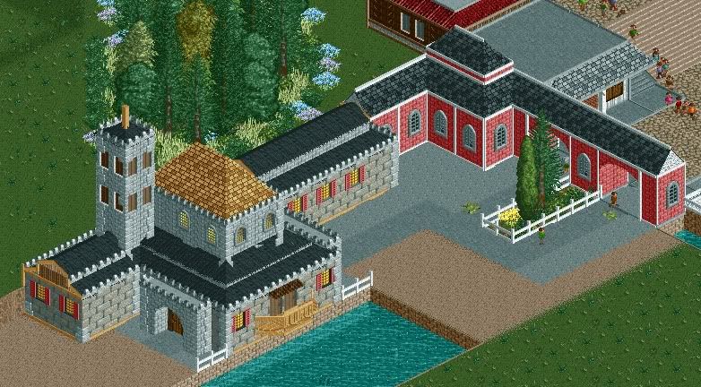
That might be the best screen i've seen from you. Except for those fucking awful wall textures. Why do you use that? Yes it does work here but not as well as brick or castle texture would. And there's almost not much as cohesion from the red and grey building seeing how they're related to each other.
But overall it's nice and the buildings on their own are certainly some of your best. Just color the grass right and remove those awful texture and color flowers -
 highroll3r
Offline
I think the buildings are nice, but the foilage at the top of the screen is awful. As Dotrobot said, colour the grass right. also id remove the two pieces of foilage on the path. The planter looks perfect. Just use that style of foilage and itll look great.
-

 wildroller
Offline
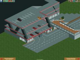
Hey all, playing around with making a nice park and am posting a very much work in progress photo before the holiday weekend! The photo is of a much different looking parking garage on the outside of the park. I am likely going to add a nice hotel on the side of the garage. Anyway feedback on the garage/pedestrian overpass would be awesome!
-

 Metropole
Offline
I like it wildroller, but i don't like how the nearest black supports are only half supporting the top level (if that makes sense)
 -

 CCI
Offline
Version 1602 will suck your dick as well..With version 1502 you can drink beer virtually

^Looks nice I could tell that Dj had something to do with that. -

 highroll3r
Offline
I dont like the trees, diagonal pathing patches and the one fucked up support by the diagonal path under the invert. Looks great and could look much better with these sorted. Theres room for a building there? Could be a great place for grub or ride related merch. Move the Invertigo sign exactly centered under the cobra and build a cafe between the rides with a rear sitting area. Its a perfect place for this and would create more of an atmosphere. Theres nothing wrong with it how it is, except the three things i mentioned already, but building a cafe seems very ideal here. Guests riding each of the coasters onece or twice and bellys start to rumble. Plus views from the rear sitting area are magical if executed correctly.
 -

 chorkiel
Offline
The path seems to undecisive. Like it's diagonal, it's not, diagonal, not, etc.
foliage seems pretty good, i know nothing about supports.
I dislike the transition between the two parts on the picture, it has no flo.
 Tags
Tags
- No Tags


