(Archive) Advertising District / Dump-Place
-
 19-April 07
-

 MeMeMe
Offline
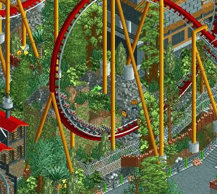
You should not use the brown dirt path because it looks (too) unnatural. And I agree with chorkiel, it is empty.
 -

 nin
Offline
Ah, thought this was your BioNemisis thing and got a bit happy.
Not a huge fan of the shade of green you've used everywhere, or the green post fence at the bottom. The building at the top right seems a bit unorganized, too many textures etc, but that may just be because I can't see the entire thing. -

 musicman
Offline
Hold on a second, did JDP use an element that hasn't been built in the real world? Let me check to make sure the universe still exists outside my house, okay, we're good. Looks great, can't wait to see it finished.
 -

 Liampie
Offline
Ah, thought this was your BioNemisis thing and got a bit happy.
Not a huge fan of the shade of green you've used everywhere, or the green post fence at the bottom. The building at the top right seems a bit unorganized, too many textures etc, but that may just be because I can't see the entire thing.
This. -
tdub96 Offline
Dang dude
Edit: The more I look at it, I dont like the awkward looking green on the awkward looking trees. But nonetheless, awesome. -

 JDP
Offline
thanks for all the feedback fellas. nin and pie, i changed the green poles to black and as a personal preference changed the lamps as well. the parks main layout is finished just need to fill it in and hopefully give k0ng a run for his money
-JDP -

 hulkpower25
Offline
here are some screens of a park i have been working for the past year.
 Lost Continent.bmp (977.4KB)
downloads: 113
 Flyer.bmp (1.15MB)
downloads: 87 medusa.bmp (1.02MB)
downloads: 67 -
 LDW
Offline
@JDP, the screen looks great. When i first saw it i was off-put by how "busy" it was. but the more I look at it, the better it gets. although I think the small green fences at the bottom of the screen stand out way too much. its nice to see the hint of another coaster too.
@hulk, the first screen also looks great and i love the way the stations are built into the rocks on both the flyer and medusa. however,I dont think your coaster designing is the best. for medusa, that inversion after that high of a vertical drop looks like it would kill someone, and the track to the left of the flyer's lift looks strange as its just out and back. maybe add some helixes or back curves to make the track look more natural. -

 Dimi
Offline
JDP: I'm sorry but I don't like it at all. Technically it's nice but there's not a single colour or colour combination that I actually like in the screen. Cool inversion though.
Hulkpower: Very well done structures and ideas, you're very creative with the game. Just a pity you use al these imo ugly objects and path types. -

 hulkpower25
Offline
Thanks, JDP, Liampie, and LDW
Guys i will look over all those details, and work on them. like coaster desgn on the bm dive, also how is the design on the Flyer. -

 Midnight Aurora
Offline
Hulk, let your work sprawl out a little. You have these nice interesting mountains, and then square them off between squared off paths. Smooth it out, make it look natural.
 Tags
Tags
- No Tags
