(Archive) Advertising District / Dump-Place
-
 19-April 07
-
 gijssie1234
Offline
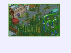
i now that building underneath, universla studios??... i think the building need more detail,
 -

 djbrcace1234
Offline
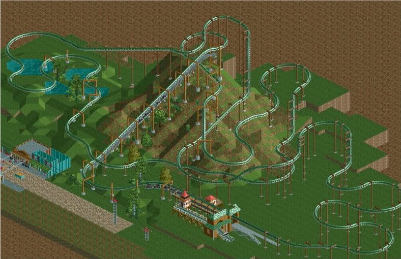
I think you have too many directional changes at the end and just before the second lift. For most suspenders, they end with a "bang," and from this look, it just seems like a forced attempt to make it longer. I like the first half, though.
 -

 CCI
Offline
Thanks I'll end up changing the end of the ride. The directional changes before the second lift is an unfinished lagoon fly over.
Also are the supports alright? -

 Austin55
Offline
Perhaps, instead of that weird zigy-zag thing you could do somesort of a helix or such?
 -

 Midnight Aurora
Offline
For the most part, any time you start using multiple lift hills, you run into trouble...
 -

 CCI
Offline
The reason I chose Two lifts was because most swingers have multiple lifts. The exceptions being Flight Deck, and Eagle's Fortress.
 -

 musicman
Offline
You wouldn't be talking about the one up in that "Canada" place would you? Everyone knows that Canada doesn't exist.
-

 MeMeMe
Offline
No, no.
It's the Communist Republic of Canada up in the north and Jesusland to the south. -

 musicman
Offline
I like everything other than the bridge in the lower left corner, something in there doesn't fit the ingame graphics well.
 -

 J K
Offline
I think it's a great screen but your foliage needs a bit more work. There is a few tree's repeated that don't seem right together and I think the foliage in the middle of the path could look better. Great screen otherwise and I love how you always produce great looking glass windows.
 Tags
Tags
- No Tags
