(Archive) Advertising District / Dump-Place
-
 19-April 07
-

 Louis!
Offline
Yeah the gravestones could be executed better. I also feel that this doesnt seem like your usual style. Maybe it's just because as you said, you are just practising.
 -

 J K
Offline
I think the glass windows kill the theme that you're going for, they always strip away everything to me. The window on the tower however is awesome!
 -

 Metropole
Offline
they are not such strong;D it goes verry smooth
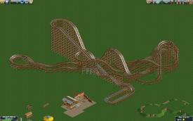
In that case Gijssie1234, surely you would need some brakes before the station no?
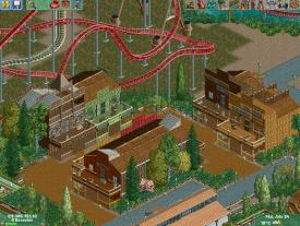
MCI, I quite like it, though I don't like the excessive use of the 3 width wooden walls with the middle wall higher than the others...if that makes sense at all. -

 coasterfreak101
Offline
^Minus the very last turn before the brakes, that looks really good! I just hate that element.
 -

 RRP
Offline
Very true about the brake run.I did have the storage area before the lift hill in an earlier version.I'll be changing that
 -

 highroll3r
Offline
MCI, I quite like it, though I don't like the excessive use of the 3 width wooden walls with the middle wall higher than the others...if that makes sense at all. agreed totally. nevertheless the screen looks great. wonderfull atmo and western style building.
RRP. i like the layout but i think theres to much diagonal track. i also agree about the brake run. your archy from what i can see looks promising.
 Tags
Tags
- No Tags


