(Archive) Advertising District / Dump-Place
-
 19-April 07
-

 djbrcace1234
Offline

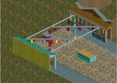
Typical Batman Clone ride, but themed
Needs a name though.. but the park is set up as a lost ruin type park
Any thoughts on the foliage/ interaction?
Overall thoughts? -

 BelgianGuy
Offline
^I agree its a coaster with some foliage, that's barely a theme sorry.
and louis is right it needs to be more compact for a B:TR -
 highroll3r
Offline
looks alright but i also agree it needs to be more compact if your going for a btr clone. i dont like the way youve scattered the 1k bush all over the place on the island, it looks to random. i think it doesnt work well with the sand.also you say your going for a ruin them. where are the ruins? get some small, tanned bricks or something in there. whats with the diagonal footer? i would remove that immedietly. i can see that theres no room for you to add a connector so improvise the support. maybe my feedback is a little on the harsh side but nevertheless im just commenting and stating my opinion freely. on a positive note i do like the coaster colours, they go well with the water.
 -

 In:Cities
Offline
That is beautiful.
Though for some reason, the symmetry of the oaks are a bit much for me. I can't quite put my finger on it, but it just looks a little strange to me.
Regardless, i like this a lot buddy. -

 chorkiel
Offline
nin that's awesome !
though if that's supposed to be a town hall, I think the pond isn't really inplace. -

 nin
Offline
No worries guys, this actually isn't the final product. The pond was placed as this was meant to be more of a theme park representation and not an actual recreation.
 Tags
Tags
- No Tags


