(Archive) Advertising District / Dump-Place
-
 19-April 07
-

 Louis!
Offline
Something I've been working on lately and its taking forever
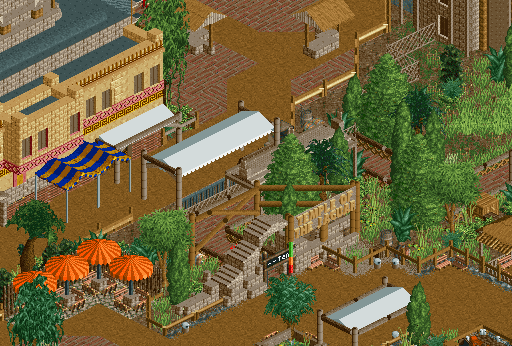
You've improved this immensely. Now I know you are serious about this, i'll get working on that layout for you.
I do think the blue and yellow awnings are a bit out of place, however I think it's because they are the only ones there, perhaps incorperate blue and yellow elsewhere and they would fit in better, as the colours themselves work very well. -

 nin
Offline
Possibly change the table umbrellas to match?
A major flaw I see in your work is unity, BG. You never seem to relate things together. This is an example of such things. -

 Fizzix
Offline
Love the theming going on there BG, but I think it would be a bit difficult for guests to walk around all those poles on the upper path.
 -

 robbie92
Offline
I really like that. There's something majestic about how that coaster looms over everything and that diagonal hill.
 -
 highroll3r
Offline
bg thats amazing. ive always loved your attention to detail.
sephiroth i like that screen alot. nice atmosphere. the only thing i could suggest is to make your own supports or something, but if its ncso then i understand.
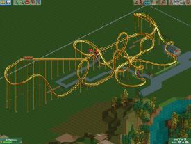
so im finally happy with the layout of this stand up. maybe its a bit to much like chang/green lantern but im going to use it in my park regardless. obviously ive only just managed to build the layout so theres clearly no scenery or theming yet. anything that you guys dont like about it please say.
-

 K0NG
Offline
These are RCT peeps. They walk through shit. They see no obstacles because they never take their eyes off of their goal.Love the theming going on there BG, but I think it would be a bit difficult for guests to walk around all those poles on the upper path.
highroll3r: I can't help but feel that you can do something with that element between the 2nd and 3rd loops to make it look more aesthetically pleasing. The idea is right, just the execution seems to be lacking slightly. -

 Dimi
Offline
BelgianGuy: one of your best screens yet! I don't like the white awnings and I prefer the parasols to be lowered one clearence but otherwise it's great.
 -
 petrol
Offline
hi i was just wondering if anyone wants to make a logo for my new starting park.. six flags over oiwa? i'm bursting with idea's so this park is a certain go
-
 Sephiroth
Offline
@Pacificoaster: Yes, which I assume address your inquiry highroll3r.
@nin: I will, but it'll be awhile; this is going slowly to say the least.
@all else: Thank you, I didn't think this would be liked as much as it is as.
----
highroll3r: I like it for the most part. It's easy to see what you're going for, but the transitions between the elements after the MCBR seem awkward to me; namely the extended corner into the second corkscrew. This element looks too forced and unnatural. -

 highroll3r
Offline
yeah i know what you mean by its to forced. it needs to be though for the final corkscrew.
Uploaded with ImageShack.us
 Tags
Tags
- No Tags


