(Archive) Advertising District / Dump-Place
-
 19-April 07
-

 CCI
Offline
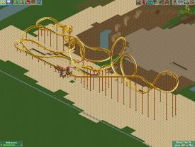
It just looks ugly. You don't have to make everything exactly like B&M either I put double corks on Bobcat instead of interlocking. It just looks like crap though, what you have.
 -

 K0NG
Offline
^^ It's an improvement....but give it some camelbacks or something after the corks so it's not so bland at the end.
 -

 highroll3r
Offline
yeah it was based off mantis pics.Your first version had me think it was a Mantis rec:


nice 1 kong. if it wasnt for harsh, but honest comments i wouldnt have made it better. i shall look into making some camelbacks.
-

 djbrcace1234
Offline
You have a very nice beginning, but after the mid course brakes again you lose that charm that Stand ups built by BM have.
Most stand ups have long transitions into corkscrews, and they fly over typically the queue lines when you look at them. The way it's built now, that 180 turn to finish the ride is just awkward. Try and make it have a fluid ending, and not compensate to find a way around pre existing tarck. The way you built s so condense, that it feels more like a traveling fair ride.
I see also that you have a Chang/ Mantis start, so look at those two and you'll see how those transitions differ from yours.It just looks ugly. You don't have to make everything exactly like B&M either I put double corks on Bobcat instead of interlocking. It just looks like crap though, what you have.
I disagree. You don't have to build exactly like a manufacture, but at least copy their typical use of inversions. No other company builds interlocking loops, and this is a way to generalize a company. however, you don't have to use them at the same intervals that a real coaster company does, because they always change styles to compliment a space. -

 K0NG
Offline
Disregard my previous post...I didn't realize that this is a stand-up. So....yeah, nevermind.
 -

 Pacificoaster
Offline
I like the layout up until the second loop. The corkscrews are interlocked too tightly. Avoid using flat turns.
Kumba, that overview makes me want to be at Cedar Point. Hands down best amusement park in the country
-

 J K
Offline
The grey 'criss-crosses' don't work well as they seem random. The rest I think is a really nice start. Foliage will take this screen to the next level.
 -
 braztaz
Offline
Okay, I didn't think I'd ever post something up here. But someone convinced me too, so here I am.
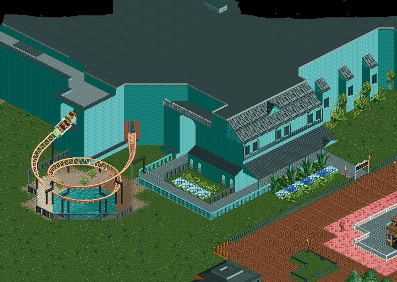
Foliage is a work in progress, and so is everything else. Yeah. -

 JDP
Offline
^i think its a promising start. get rid of your path selections on the midway though
-JDP -

 petrol
Offline
hi.. i decided to make a park out of that white coaster of mine. it;s gonna be a six flags.

last screen: what do you think about the escape stairs.
PS: park name is probably gonna be six flags over iowa -

 F0ndue
Offline
Petrol thats awesome.But I`m not sure with the flowers,maybe change to round flowers,this seems more natural.And the
B&M looks to much like a jet coaster. -

 petrol
Offline
right away on the flowers
buttah what is a jet coaster? and what excactly is a b&m coaster
-

 F0ndue
Offline
Well,B&M is one of the worlds most renowmed coaster manufacturers and have this typical type of track.Oh BTW they`re from Switzerland.Get more infos from your best friend:
http://www.rcdb.com/
And well jet coasters are kinda primitive coasters found in japan and china.They usually have fucking slow lifts,unbanked turns,straight drops,painfull trackwork,unneed OTSRs,are boring and have terrible paintjobs.
Or in other words:
http://www.urbandict...erm=Jet coaster
I just think that the trackwork looks a bit weird and the pink is unfitting.
 Tags
Tags
- No Tags
