(Archive) Advertising District / Dump-Place
-
 19-April 07
-

 petrol
Offline
@djbrcace1234: don't like the high fence next to the road on the water side. i think guests will enjoy watching the water ride
-

 chorkiel
Offline
Thanks for the response I'll rebuild most of it and post a newer (I hope better) layout later.
 -

 Roomie
Offline
Hey Louis. Just wanted to explain a few things from your post
Yeah, I'm not saying don't use codex. codex is a brilliant tool, but here, for me, there is the use of codex where it isn't needed. objects being used for no real purpose, well it seems like that, for example the barrels on the side of the walls, what purpose do they have? the big '9'. what reason is it there for except for the coaster to go through, etc.
it doesnt have to be classic LL to have LL charm, plenty of codexed parks (loopy's WoT included) still keep the LL charm, it's just this doesn't seem to have any.
The Big 9 is my version of this at La Qua.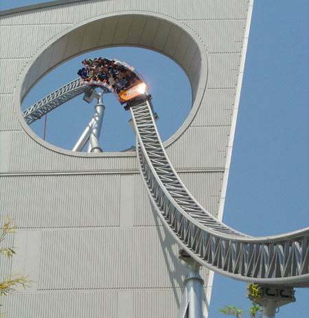
There is no reason for this bit of the mall apart for the coaster to go through. Robbie was telling me it's called Forced Architecture.
The Barrels on the big wall are a rather unsuccessful attempt to hide the fact that the raised path behind the walls shows a brown line running along the whole upper edge of the wall. I might try to place a set of walls on the closer square to hide those.
Anyway here's a slightly updated version where I've changed the force architecture to slope more into the roof and removed most of the unsightly wooden path slopes which looked so odd. I think the shop roofs work better.
I'm messing around with curved roads on the entrance to the car park as well.
---------------------------------------------------
djbrcace1234 I really like that screen. Although I agree with what people have said relating to the lower fences. The colour scheme is nice too but it depends somewhat on exactly what the theme is
The little ruins section in the bottom left is nice too. -

 chorkiel
Offline
roomie, those monorails next to the road are pretty cool!
btw whatya doing in our country right now ?
-

 tdub96
Offline
Looking good DJ, and I love that Roomie!
--------------------------------------------------------------------------------
Here's what I've been working on lately, been advertising it a bit at TPR. Its Project Patriot, an American-themed GCI in the USA area of the North American Adventure Park.
Here's what I have so far: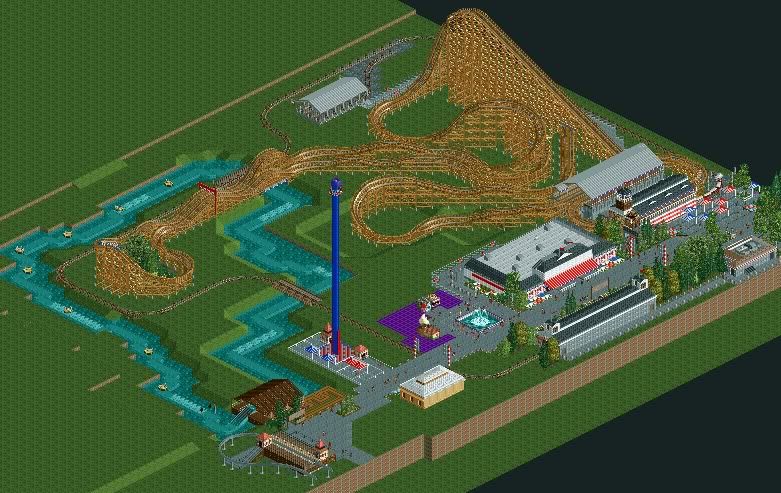
Freedom Fighter (GCI 2009)
Mississippi River Rapids
Patriot Plunge (Intamin drop tower)
If someone could make entrance/exit huts invisible for me, that'd be great. Comments and critiscm welcome, I'll try to post some close up shots later, but let me know what you guys think!
-tw
EDIT: If anyone was wondering what that big building is to the left of the coaster's station, its an American History museum which was an idea I had that sprung this design attempt. It houses a little dark ride (Haunted mansion ride). -

 Roomie
Offline
roomie, those monorails next to the road are pretty cool!
btw whatya doing in our country right now ?
First off thanks for the comment
Secondly I am in fact not in the Netherlands or even in the UK. I am in fact probably the only RCT player currently in Nigeria. I Just happen to be connecting to the Internet over a Satellite feed which has its base in The Netherlands and therefore NE and every other site for that matter thinks I am there.
-

 chorkiel
Offline
^whatya doing in nigeria then ?
@tdub, that looks pretty good, I suggest the purple disco floor is where buildings are needed ? -

 Roomie
Offline
Working out here surveying oil fields at sea. Will be here for another month or so. Plenty of RCT time on a ship
-

 Midnight Aurora
Offline
Roomie, you could probably take advantage of the isometric views to fill in the gaps of that curved path. As in float a bush off the ground so it looks filled in. It should be hidden by the highway from the other views.
 -

 pierrot
Offline
Roomie, you makes me jaw-dropping.
honestly, not fan of '9' structure, looks odd for me. concept is really cool though. -

 highroll3r
Offline
After the second looping it looks like shit, sorry.
wow thanx alot!!! whats wrong with it after the second looping?
stand up coasters are cunts to build. i never build coasters with an extreme intensity rating. i obviously want peeps to ride it. i looked at mantis' layout and this is pretty similar but for the bit after the corkscrew. -

 Liampie
Offline
ur welcum
Too many weird straight pieces, inconsistent radius in every turn and an anticlimatic sequence of elements.
 Tags
Tags
- No Tags


